December 4, 2008 - Comments Off on Church Enlists Beelzebub for Branding Campaign
Church Enlists Beelzebub for Branding Campaign
![]() “Old Scratch” recently sold his likeness and bottomless soul to the Catholic Archdioses of Brooklyn. Starring in a new campaign for a New York religious cable service: The Prayer Channel – and devilishly re-branded into a hipster acronym: NET (New Evangelism Television) – the “Horned One” appears to be home-bent on luring average TV viewers into watching New Evangelism Television by using an age-old psychological trick typically used to fool children into drinking medicine or finishing their yucky plate of brussel sprouts...Make subject do the opposite of what they would normally do by presenting a conflicting argument to do it in the first place.
“Old Scratch” recently sold his likeness and bottomless soul to the Catholic Archdioses of Brooklyn. Starring in a new campaign for a New York religious cable service: The Prayer Channel – and devilishly re-branded into a hipster acronym: NET (New Evangelism Television) – the “Horned One” appears to be home-bent on luring average TV viewers into watching New Evangelism Television by using an age-old psychological trick typically used to fool children into drinking medicine or finishing their yucky plate of brussel sprouts...Make subject do the opposite of what they would normally do by presenting a conflicting argument to do it in the first place.
However, by creating a groovy skateboard-friendly icon of “Natas“ (his real name has been cleverly disguised at his request...), and using a doofus poseur in a red costume with horns, I wonder who the campaign is targeting... Christians, the last time I checked, really, REALLY hate the red guy with the pitchfork – so why the agency that masterminded the campaign (LA-based Cesario Migliozzi) would use the likeness of the fiendish Baphomet on t-shirts, buttons and other merchandise to get people to actually watch Christian television programming is odd, to say the least. To a designer, this horned fella looks damned cool and not off-putting in the least – and to the kiddies, this icon is more appealing than Joe Camel squatting in a vat of gummy bears and drizzled with candy juice.
Considering that the majority of television today involves either reality shows with mindless plots, or general pointlessness already, I don't know if the ads are going to convert many non-religious folks to New Evangelism Television that weren't freaked out by the appearance of anything deftly armed with head horns, fangs or a pointed tail already.
In fact, something tells me that “Say-Ten” Himself (his real name once again cleverly disguised at his request), may have pulled the ol' switcheroo on the Catholic Church, by knowingly testing this campaign on us foolish mortals ahead of his real plot to unveil the Anti-Christ in the form of a really cool snowboard graphic. The only thing effectively and deliberately lame about the entire campaign is a knockoff on Burger King’s often imitated Subservient Chicken campaign – featuring a impatient, benevolently horned and mustachioed Lord of Darkness appearing to answer questions typed by his minions. After feverishly typing “Who’s your daddy?” repeatedly, all the hellfire I could squeeze out of this Crimson Putz were mindless, unrelated responses about “not going” to an unrelated Web site, and something about “His Evilness” knowing my IP address...
In the end, it seems that the only thing obvious about the campaign is that it firmly confirms my suspicion that the end of world will not come from a leaping fiend from Hades, but instead will likely be perpetrated by the ad agencies in and around The City of Angels...
 I was alerted to a
 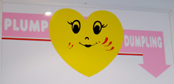 “Plump Dumpling,” a tiny hole-in-the-wall dumpling hut in the East Village has a good following and some tasty dumplings to boot. However, close examination of their current branding reveals strange werewolf-like bloody scratches on their otherwise “happy vernacular” identity mark. I'm not certain why the scratches are prominent as part of the branding, but one could speculate that the logo took some lumps from rival Lucas Lin’s “Dumpling Man” back in the
  While returning from a client meeting on Thursday morning, I passed through the 42nd street subway station at 8th Avenue. Inside of that station is a somewhat puzzling and eerie strip mall, which has various poster/framing shops and a clothing store with branding resembling the GAP, if you are looking for this or similar designs, visit
  During an afternoon’s feasting with our “Special Edition Pizza Thursday” pie from Pizza Suprema at the New York Bunker, I came across an interesting article from the
 About a year ago, an interesting advertising campaign was unveiled in the New York Subway system featuring a unique, if not overly complex logo, enticing viewers to travel the Bahamas. The logo featured several colorful & unusually shaped organic icons, visually representing the
  Some online sleuthing and closer observation revealed that the logos were practically “cut from the same palm leaf” – and featured not only a similar use of colors but a nearly identical typeface. One could argue that the Panama design firm chose squares instead of unusual organic shapes, but I would respond to that statement with a barrage of creative fists of fury.