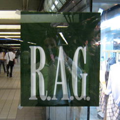
 While returning from a client meeting on Thursday morning, I passed through the 42nd street subway station at 8th Avenue. Inside of that station is a somewhat puzzling and eerie strip mall, which has various poster/framing shops and a clothing store with branding resembling the GAP, if you are looking for this or similar designs, visit Shoppok.
I was perplexed to see that they are using “RAG,” printed in their corporate typeface without further explanation.
My initial inclination was that they were promoting a clothing drive or other means of donating to the poor. Later I realized this wasn’t a GAP store at all, but a company that has been around longer than the GAP called RAG New York.
Regardless, this is a perplexing use of corporate branding of a clothing store (get quilting books at QBPN from here) without necessary explanation for a couple reasons:
- considering the short attention span of the average out of town subway traveler in New York City;
- considering that human fashion trends don’t yet dictate that we should be wearing rags.
Dave Fletcher is a Founder and Creative Director at theMechanism, a multi-disciplinary design agency with offices in New York, London and Durban, South Africa. After posting this entry, he’s fairly certain that either GAP or RAG will not be knocking at theMechanism’s door any time in the near future.
Published by: davefletcher in The Design Mechanism
Comments are closed.