March 6, 2008 - Comments Off on To Re-Brand or not Re-Brand… That is the Question.
In the grand Shakespearean Play of your business, the most overlooked yet most important asset of your company is your brand. You can spend copious amounts of money on infrastructure, desks, equipment, great employees, and all the copies of Microsoft Office you can shake Bill Gates' quarters at, but without your almighty brand - your essence and first impression - you're dead at the starting line...guaranteed. Think about how many times you get to make a first impression with a potential client? One if you're lucky. And that time is money.
Your “Brand” encompasses many things, but most importantly involves a logo, a mantra or methodology, a color palette and a typographic palette. Your brand also relates to how you communicate with your audience, your fellow employees and how you want your employees to communicate with the outside world. It represents – and is representative of – every part of the corporate ecosystem, living together in a positive and rewarding symbiotic relationship.
Despite all of that talk about one chance to make an impression, realize there are plenty of potential clients that haven't yet had the pleasure of connecting to your brand, so it’s not too late. Face it, after a few years of scraping to the middle of an industry, a little botox, and maybe a nip and a tuck on that brand couldn’t hurt. If you think I jest, go ahead and ask Ms. Hilton, the living embodiment of “human as brand...”
Before you jump right into the branding experience that very few business managers and owners dream of, please consider the following:
- Do you have a budget in place to get your brand where it needs to be? A branding initiative is going to cost money. For instance, if you're selling custom shirts, then you'd need to buy uv flatbed printers. If an agency or freelancer gives you a cheap deal, think twice about whom you’re hiring for this important job. When you pay peanuts you don’t just get monkeys, you get the laziest, carefree, baboons in the entire forest. Would you hire a discount dentist? How about the doctor who is going to perform open-heart surgery on you? Or the guy that is fixing the breaks on your family wagon? So, why would you entrust your important brand, which in many ways is responsible for maintaining the affection of your employees, clients, and your salary in the hands of a hack? And, if you’re going to re-brand, please don’t just slap a new logo on your website and keep using your old stationery until it runs out. Not only is it silly, but it will not justify the amount of work that should go into a new branding initiative.
- Have you formulated a mission statement, or mantra for your business? In other words, have you really considered why your business works and why it doesn’t work? Any creative firm you hire to assist in the re-branding process should be asking your team questions about this stuff. If they are not, please show them the door before you pay them their huge fee and proceed to hate the rest of us “designer types” forever.
- Why are you re-branding? If you’re re-branding because the business is failing, more than likely, you need somebody to come in and figure out much more important things about your overall business model. A new logo can’t help you now. If you are re-branding because your pal “Hank” just got a neat new logo from his son’s nephew’s girlfriend, chances are a new logo isn’t what you need.
A branding company should be concerned with how your new identity will interact with a website, your collateral, your stationery, your presentational materials, and even more importantly, by exploring the way your employees describe your company to the outside world.
Okay, you’ve gathered some of your hard-earned cash together and hired a stellar graphic design firm to sit down and extract from you and your team the very essence of your nubile brand. What should you expect from these raptors masked behind their fancy shirts and goatees? First of all, you should expect (and demand) patience. In many cases, the experience you’re about to go through is a lot like describing an average child to a group of strangers with honor students. Nobody enjoys answering questions about their competitors and what they think is successful and unsuccessful about their current brand. However, it is a painful, and very necessary conversation to have.
Below are some of the questions you might be asked by the creative team you’ve hired to assist with your re-branding process:
- Name 3 of your competitors and what makes them successful?
- Describe what makes your organization successful?
- What aspect of your business would you change if you could?
- If you met a new customer today how would you describe your brand to them?
- If you met a friend on the street today how would you describe your brand to them?
- How do your employees value your brand?
...See, there’s a reason you’ve gathered this team of Treo-toting, pencil chomping Macintosh advocates, right?
Good designers are great problem solvers. They are the good folks you tap on the shoulder on the commute home when you need a word for “effectively solve” that begins with “right now.” They are not scary brainiacs, they are just immersed in all the things that you don’t necessarily have the time for: typefaces, color palettes, layout styles and innovative solutions are what they live and breathe for. Don’t despise them – pity them – because in the end, while you can go home and zone out in front of the TV watching the latest episode of ER, they are busy stressing over the font, motion graphics or color choice from the commercial that you skipped because you were too busy enjoying that conversation with your little son or daughter. Trust me, they’re not lonely people, they are just obsessive, and the good ones are obsessed with solving the problems that clients like you bring to them daily. You want this type of person on your team as much as they need you to pay your bills. It’s a symbiotic relationship.
Generally, a re-branding experience is not for the faint of heart – yet most of the time, if you go into the situation with an open mind, you’ll find yourself working very well with the design team you’ve chosen. Warning: If the leader of this team of creative gorillas (they’ll refer to him as “Creative Director”, ”Poobah”, or something even more unnerving like “Chief” and they’re either wearing sunglasses or have the longest, and most well-groomed goatee of the team) pulls out their iPod and asks you to speak slowly into the microphone, reach for the nearest weapon and start swinging for the bleachers – technological devices and snarky rhetoric don’t make for a good design firm. However, if they are a chatty, concerned and positive bunch, keep an open mind and please allow them to continue. Likely, you’ll be surprised at what you will learn about your company throughout the process.
 I was alerted to a
 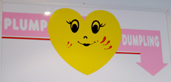 “Plump Dumpling,” a tiny hole-in-the-wall dumpling hut in the East Village has a good following and some tasty dumplings to boot. However, close examination of their current branding reveals strange werewolf-like bloody scratches on their otherwise “happy vernacular” identity mark. I'm not certain why the scratches are prominent as part of the branding, but one could speculate that the logo took some lumps from rival Lucas Lin’s “Dumpling Man” back in the