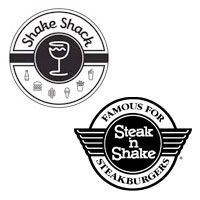
 I was alerted to a comment trail and venomous ranting occurring at a Web site called Eater.com, where several creative folk and other knuckleheads are going apeshit over the similarities between the logos for Steak n Shake and Shake Shack. Some of the foulest bile is being hurled by people who found out the logo for Shake Shack was designed by “someone” at Pentagram, a highly-regarded global branding and design firm and home to creative luminaries Paula Scher and Michael Beirut.
We could have avoided the blog post except that an “unnamed designer at Pentagram” decided to “teach the kids and haters a lesson” by flinging his own monkey poo into the fray:
“I designed the new Shake Shack identity and the original existing identity. The permanent signage on the exterior of the new Shake Shack will appear as the original logo, familiar from the Madison Square Park location. The new retail identity will be used in the interior for items like menu boards, cups, paper and packaging, but not on the architecture. The sign in your shot is temporary--it's just a piece of paper.
The new identity is not an homage to Steak n Shake. The typography has nothing in common--the new Shake Shack logotype is in script. Sometimes it appears straight. Sometimes it will appear in a stamp or seal in a circular motif. Saying it's a rip-off of the Steak n Shake logo is like saying a hot dog is just like a hamburger because they're both in a bun.”
Thanks “Mysterious Designer at Pentagram” – you have put the people who are been yammering about this nonsense in their place – not only with your mastery of the obvious, but with your snotty and authoritative tone. By mixing phrases for designers (“...it will appear in a stamp or seal in a circular motif”) with ironic comparisons designed to resonate with total morons (“hot dogs and hamburgers”? Really??), you’ve actually stooped to the very level that a masterful agency such as Pentagram should always choose to remain light years above.
Comments are closed.