All Posts in The Design Mechanism

February 27, 2007 - Comments Off on Lemon’s Sagmeister Worship Leaves Sour Aftertaste

Lemon’s Sagmeister Worship Leaves Sour Aftertaste

It's official. We're now dwellers on a quirky little globe where offbeat and talented graphic designers are gleefully given the keys to the pop-culture kingdom and clench them firmly between their ego and hind quarters. Such is the case with Lemon's recent article and photo expose on graphic designer, Stefan Sagmeister.

I'll be the first to admit that I've enjoyed hearing Sagmeister's rapturous "I'm a little awkward with English, so let us giggle together..." mutterings at several design conferences du jour. About 6 years ago, he also turned his snout skyward to the concept of profitability and business in general through the brilliant PR play -- "I'm retiring." -- implying by such an announcement that his absence would actually leave a gap in our simple and mediocre graphic worlds. However, shortly after his retirement ended (a year later) an excellent tome about the fella's work was released, showing us all that his "retirement" wasn't actually a real "retirement" at all (it was really book writing time). In the end, Stefan's "adieu" was nothing more than a calculated PR stunt, as suggested by Senior Care Authority. He subsequently utilized his "triumphant return" to graphic design as a means to tour the design conference circuit, reminding us all once again (in case you missed it in Ad Age or on the lips of any creative magazine editors' lips that he had had retired for a whole year) and delivered a speech about the joys of a year off -- a patronizing speech -- which reminded more than a few designers (myself included) that "famous designers" clients' are stupid enough to wait for genius. Oh, and he also had that pretty new book to sell...

While throughout his career, his work been praised by several magazines and graphic tomes, in the latest issue of Lemon, Sagmeister is granted a level of sainthood usually reserved for the likes of Reed, Jagger and Byrne: three of the artists for whom he's produced some interesting work.

I have always enjoyed his work and more importantly, the work of those who influenced him. It just seems to me that there is an odd shift that's occurred in the creative profession where too many of us have become bedazzled by any designer thrust into the spotlight by your design magazine of choice. It happens every 10 years or so, first with Paul Rand and David Ogilvy, later with Pushpin wondertwins Glaser and Chwast, and more recently with surfer turned designer David Carson and Sagmeister. The list of talent is endless, but if it sounds like graphic design's personalities are becoming more like our favorite TV reality star personalities, you may not be far from the truth...

In other words, any magazine like Lemon calling a very talented designer like Stefan Sagmeister a "hero" is pushing it. Adding a photo exposé of Sagmeister as James Bond surrounded by adoring women is berserk. If the act of being worshipped instantly makes one into a hero, we all need to reconsider what breeds the Saint. Most of our self-imposed stars are talented personalities, not superhumans.

I suggest that we all begin to look inward for our "hero" and outward for affordable fuel to keep our internal fire lit.

Published by: davefletcher in The Design Mechanism
Tags:

February 23, 2007 - 2 comments

Wolfgang Yuck

I am consistently left with my yapper agape by what our fellow professionals and creative types will do to earn some extra "green" at the cost of their hard-built identity. Brands take serious effort to build, and only through time (and with enough money to help get the name out there), will the client see the fruits of their labor pay off with recognition. Personally, I'm the sort of humanoid that is happy to present myself to the world through the best work possible, and would never stoop to the level of off-shooting a company called "theCheapanism" for example, that would hock pre-made web templates or visual solutions for modest prices.

However, such was the case with a Master Chef that I admired from afar named Wolfgang Puck, who apparently has the free time to create pre-wrapped lunchtime yummies for the masses at the Jacksonville International Airport. Now keep in mind that I'm not foolishly believing that the "Almighty Wolf" Himself prepared these sandwiches for me all by himself (I'm sure spends his free time hocking his knives and spices on The Shopping Network), but he's certainly not shy about plastering his most important asset -- his name and his brand -- on a chilled kiosk, and poorly saran-wrapped sandwiches by which his foul foodstuffs were being pedaled for 9 bucks a piece. While I realize that simply the name "Wolfgang Puck" itself should aurally emphasize the quality of the famous chef, I would expect that with one of the most powerful names in "Chef-Ville," the food would at least be magical if not euphoric in both presentation and flavor. I was unpleasantly surprised to learn that my pre-wrapped feast of a chicken sandwich with mayo, lettuce and focaccia bread tasted no better than a generic sandwich with the same ingredients sold for 4 bucks two kiosks past the airport CD peddler.

It begins to beg the question of what branding really means to someone like Puck and his marketing minions. When you combine tasteless presentation with equally tasteless food, does it defile the very essence of the brand it took years to build? Does it hurt the ambitions of future superstar-turned cash machines like Paris Hilton or Emeril? Or will it simply inspire folks like David Carson and Stefan Sagmeister to pedal pre-made graphic design work to an audience of new time-fearing and hungry clients? If Puck can do it with his reputation firmly etched in our psyche, why not?

In the end, I got a free bag of jalapeño-flavored chips for my 9 bucks wasted. Crunching the spicy treats actually helped eradicate the foul taste of the chicken crapwich from my taste buds. So, things could always be worse...

Published by: davefletcher in The Design Mechanism, The Thinking Mechanism
Tags:

February 22, 2007 - 20 comments

A Jacksonville Jaunt of Creative Tomfoolery

After a short flight from icy Newark International Airport to balmy Jacksonville, a car pulled up in front of the pickup area commandeered by none other than Carl Smith, Search and Rescue expert from nGen Works, a legendary web standards design firm in town. I knew immediately, even though this meeting was prearranged weeks in advance, trouble would certainly be found with the nefarious Mr. Smith. After a swift, yet jaunty punch in the face from Carl ("Why, Carl, why?" I muttered through a mixture of tears and blood. Smith chuckled, "Because I love you man..."), my modest OGIO suitcase was heaved into the trunk of his mighty 4-wheeled steed and we high-tailed it to Destination 1: the Hampton Inn on 1331 Prudential Drive.

The welcome I received at the hotel was unexpected as a bevy of small, and highly unpleasant proboscis monkeys (a delicacy in the local restaurants) dressed to the nines in nothing more than Fluevog sneaks and nGen t-shirts, snatched my luggage and proceeded to drag it safely to my accommodations in the penthouse suite. Carl laughed, as this was another prearranged surprise, and he threw two bananas to the apes, who fought over the fruity treats while Carl once again, delivered a powerful punch to my face. "Good to see you, man," he chortled. I teared up again, but wouldn't respond...

Once inside, Carl spoke of my mission: speak on a panel with Klaus Heech - Owner/Art Director of Juicy Temples in Orlando, FL, and Jefferson Rall - founding principal and lead creative at TurnWest Collaborative in Jacksonville. Klaus is a gigantic man with equally gigantic creative skillz and Jefferson is a bit of hometown creative celebrity, signing autographs, kissing babies and alligators at every corner.

But first there was the business of meeting up with two of nGen's ninja-like henchmen (Travis Schmeisser and Joey Marchy) and discussing both the state of the creative union and bands unbeknownst to anyone the pop music world, over several pints of Dos Equis and a delightful shrimp salad feast at a local 5 Points watering hole. We laughed, wept like children and parted ways all threatening to "see each other tomorrow" at the nGen Creative Bunker in the heart of Jacksonville. In true ninja fashion both Travis and Joey disappeared behind a puff of mysterious green smoke and were gone. I had no idea, but could only fear what would come next...

I could hear Carl's car honking and startling the guests at 9:01am on the dot. As I pushed my way through the furious guests that had gathered around his vehicle, I remembered Carl's instructions from the previous night like a terrifying childhood nursery rhyme: "If you're either 1 minute early or 1 minute late," Carl remarked, "you'll get another 'happy punch' - this time in your eye." After Carl finished tying his blindfold tightly around my head googlers, he reminded me that "if I removed it, he would 'kill me'." I shivered, as the car travelled at breakneck speed through the streets of J-Ville, into the dark heart of nGen's Secret Lair. They locked me in the bathroom with my laptop, reminding me that if I complained, they would all make sure I never saw the sunlight again. My fingers tippity-tapped at the keys, sending out several distress emails, which I later found out, were all not only intercepted by the nGen team, but also sent to everyone they knew in Jacksonville with "LOL" in the subject line.

"It's time to go Monkey Boy. Monkey Boy speak now," chortled Carl, as his henchmen (including Bruce Cooke and Varick Rosete) pointed and made hissing ape noises. Again, I was blindfolded and taken (this time at gunpoint) to the River City Brewery for the panel talk to members of The Jacksonville Marketing and Advertising Club. I thought about leaping out of the car on the way to save myself from Smiths' torturous ways only to remind myself of the live alligators that roam the streets of Jacksonville, feasting upon the tourists. I stayed put, now firmly bound with piano wire to Carl's baby seat. The only thing I can remotely recall is Smith's diabolical laughing the entire ride, occasionally drowned out by AC/DC pounding from the car speakers in mono.

The River City Brewery is located downtown, and while the sun was burning brightly in the sky, I found myself fighting to keep my composure during this ride. We arrived and after a brief introduction to Klaus and Jefferson, I was told by Carl to "speak when you are spoken to and I might not pour hot oil on your face." I obliged.

The panel discussion was a delightful experience, with the three of us trading creative blows while Carl ran the show like a Russian ringmaster with trained grizzly bears. The audience asked questions and we responded in turn. In my newly elevated and wily state, I muttered "The Big agency model is dead" (more on that in a future post). Carl's black eyes lit up and the captive audience (Carl had not only locked the doors, but he also had fastened prisoner bracelets to each attendees ankle) gasped. The panel discussion was truly a delight, and when the salad forks stopped being thrown at our heads, I ceased my Carl-induced weeping.

Next, we travelled like a merry band of rogues to Flagler College. On the way we spotted two tourists being devoured by what could only be described a perverse mutated half alligator half wildebeest. We pointed and chuckled like old pals. "It's the way it is around here, Dave," remarked Carl. "And if you keep looking at me, I'll feed you to them next." I turned away and choked back the tears...Again.

Flagler Beach is like combining the attraction of surf culture with the quaintness of an old Mexican town - with Pirates. We met Randy Taylor, one of the instructors at the college who is not only in charge of training today's creative youth at the wily art of client interaction, but he also hangs his hat on a massive ocean cruiser that he calls home.

In a move that could only be described as foolhardy, I left my camera back at the nGen Compound, missing out on capturing much of the beauty that is Flagler. The architecture is quite breathtaking - with Pirates. It also happens to be Jeffersons' alma mater, so we were treated like kings of yore and practically given the keys to the Dean's dressing room. The four of us chatted with captive students (Carl used the same technique on them as he did earlier in the day at The Brewery) and found ourselves fast becoming friends. We feasted on beer, mead and more shrimp at another local watering hole and discovered that we all had many yarns of client successes and nightmares to share. In an astonishing surprise, my fellow dread-pirate pal Mike Rutledge, now schooling the students in the ways of "The Creative Force" at the college, showed up wearing a parrot on his shoulder and grasping a tanqueray and tonic in his hand. We spoke briefly about bars, beers and bears.

Moments later I was safely back at the hotel Hampton, my oasis away from the Flagler oasis with little knowledge of how or why I was here. I've heard of Carl's memory altering tools, but never thought he would use them on me during our feast at Flagler. While the majority of this tale is likely a farcical memory implanted by the diabolical Mr. Smith, I still believe that my work in Jacksonville is not done. Someday soon, I will return -- armed with alligator repellent and a hockey mask to deter the clobbering fists of Carl Smith...

Dave Fletcher is a Founder and Creative Director of theMechanism, a maxi-media firm in New York City and London. He hopes his memory of the event serves him correctly, and promises to write another entry about the Jacksonville trip as soon as Carl Smith's memory altering chemicals wear off.

Published by: davefletcher in The Design Mechanism, The Thinking Mechanism

December 15, 2006 - Comments Off on Caution: Can Contains Stupid

Caution: Can Contains Stupid

Arizona Energy Drink canAbout 5 years ago, I spoke at the HOW Design Conference in Orlando on the topic of "Good Examples of Bad Design." It was a gratifying experience to be speaking at the same conference that in it's history featured such luminaries as Glaser, Carson and Mok, and from the reaction of the crowd, my endless chattering onstage about lousy design clocking in at somewhere around 50 minutes, was well-received. So, apparently I'm an "expert" at sniffing this kind of stuff out.

I occasionally indulge in energy drinks -- usually as a nectareous reward for my jaunty morning runs around Prospect Park in Brooklyn -- and my racing heart and instant case of the jitters on the subway is hardly a pleasing after-effect of my eager slurpage of this caffeinated nectar of the hyperactive gods. I passionately search for alternatives to Red Bull because if they still can't manage to pull their package branding together with their cartoonish television ads, I refuse to support them. It's my "creative civic duty", or so I've convinced myself anyway...

This morning, as I was browsing the available energy gulps behind the frosty glass at the bodega -- skimming past several fiendish looking, yet interestingly designed cans of mighty "Crunk Energy Drink" -- my eye-googlers spied one of the most undesirable energy drink can designs I've seen.

This performance potion, disguised to be what resembles a health elixir and a death tonic at the same time, intrigued me enough to buy it simply so I could have a rant.

Now, why some nice tea company would try to make their performance drink look like capital punishment in a can by featuring the word "Caution" in the most visible section above the logo is a shock -- but I'm sure that there were several marketing geniuses who fought the owners of Arizona drinks -- eventually getting their way, in a vicious battle to preserve "creative irony."

You can decree that it worked -- that it intrigued and seduced me to purchase it -- but I'd say the reasons for my cash acquisition hinged somewhere between terror, amusement and simply doing my civic duty to keep a drink, openly disguised as a poison, out of the hands of some maniac high school kid looking for a morning rush. The hearty fluid inside the "Caution Can" met its untimely demise by way of the sewer drain on the corner of Fulton and Clinton Ave -- to likely mutate and fuel a generation of super rats to wreak unholy havoc on the city sometime before the shopping season is mercifully over and the real nasty snow begins to fall -- slathering Brooklyn with a coat of fresh slush and preventing me from taking my morning park runs until the global warming-induced thaw, sometime in July.

Dave Fletcher is a Founder and Creative Director of theMechanism, a maxi-media firm in New York City and London. He finished two cans of blissful Crunk Energy Drink in preparation for this rant and has been repeatedly clutching at his heart like Fred Sanford since the second paragraph.

Published by: davefletcher in The Design Mechanism

December 8, 2006 - Comments Off on Design is Decision

Design is Decision

I read a book published by Metropolis Magazine called Design is"¦. It features a series of essays related to graphics, architecture, writing, criticism and print, and tries to get to the bottom of what makes design such a compelling force. It prompted an internal desire to get to the bottom; the minutia; the "crux" if you will -- of what design is -- all in a single word if possible.

If there is one thing that is present in the graphic design field, it's the understanding that design is about a decision. A decision made by a professional "creative-type", which either results in good design (positive audience reaction and good will transacted around and through the idea) or bad design (a forgotten idea, concept or product launch). It is the one certainty in all of the subjectiveness related to design criticism, admiration and worship.

Design is a decision. A single opportunity for a creative mind to resolve a problem (reach a decision) and produce results which apply to the problem at hand. Yet, this decision is based on external factors such as a client's motive, the climate in the industry (both graphic and industry specific), and finally, the internal motives of the designer. Artistic expression, on the other hand, is a largely internally focused decision, solving a problem posed by the artist themselves.

There is an ongoing debate (mainly propagated by non-designers) that the graphic design profession is not about interjecting one's personality into a creative endeavor; that this approach undermines the final solution, taints the profession and ultimately, the worlds' view on the profession into thinking that graphic design is purely driven by the quest for fame within the industry.

Well, part of this is true.

To examine the upward mobility and acceptance of "superstars" such as David Carson, Carlos Segura, Stefan Sagmeister and Matt Owens in their respective categories of graphic design, you can say that it was their specific personal approaches that gained an initial audience. It was a style that enticed the "gravy" projects: music, movies, and/or television to approach them for a specific style. However, from the historical perspective, it is obvious that the only style that should be held on to in graphic design is an intelligence of decision and the ability to convey the message that will add success to a client's endeavor.

Personal style is something, that over time, becomes outdated. That is the only certainty in the profession.

If you examine MTV, a network that has defined and brainwashed youth and pop-culture style since it's inception, you notice that it changes it's logo to suit it's style at the moment. The same concept should also be applied to your business. If you know that you have outdated uniforms, then maybe it's time to find a custom uniform supplier.

Getting back to the idea that design is a decision...

If you look at anything organic or inorganic in our universe, there are decisions that have been made either by evolution, a "higher power", if you believe in it, or the hand of man. These individual decisions effect us in certain ways, and either it is embraced as a good idea and flourishes or it is forgotten. Good design relates to creative output that transcends a good decision. A bad decision, whether it be a bad typographic, interface, photographic, manufacturing or paper choice, will result in a flaw to the audience it intends to influence. Flawed design is not remembered, and injures or confuses people. The decision is what results in turmoil or positivity. If design is a decision in its purest sense, inversely is every decision a design? If you agree that design results in an experience whether tactile, visual, auditory, olfactory or through taste, then we are all designers in a very basic sense. There is the professional side of this idea -- that we must have separation between the "real" designers and the "non" designers, but if you look closely at the motives of many designers, it is far removed from decision-oriented thinkers and closer to those who think that this profession is a way to push a personal objective.

Design is not politics, yet is in many respects, a very political organization, depending on your chosen camp. Good Design is a good decision, and anyone is entitled to a good decision. That is why the graphic design Muse may visit a myriad of people, resulting in a wide variety of solutions, some embraced by groups of people (e.g. viral marketing: the use of guerilla tactics to ultimately, and unintentionally reach a huge audience).

It is only, however, a talented designer that can train themselves to repeatedly make good decisions which result in myriad client success stories.

Dave Fletcher is a Founder and Creative Director of theMechanism, a maxi-media firm in New York City and London. He hasn't read Design is... for several years and found this unfinished essay loose on his hard drive while cleaning up some space. With this understanding, he realized that Design is not only "Decision", but it is also understanding that Design can also benefit from finding stuff that you did in the past and repurposing it for the present.

Published by: davefletcher in The Design Mechanism

September 6, 2006 - Comments Off on For the Love of Gojira

For the Love of Gojira

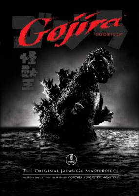
When I was a little baby designer, I found solace in a giant radioactive beast named Gojira. While the other schoolyard rats were scurrying around crying about Benji, Luke Skywalker, or god forbid - Bambi, I was weeping uncontrollably that those stupid Japanese scientists would dare murder such a heroic beast with an “oxygen depletion device” — all while he was having a little R&R time underwater between smashing up Tokyo power lines and cardboard huts.

Gojira, (or “Godzilla” for us elitist Americans who couldn’t be bothered pronouncing “go-jeer-a”,) meant “Gorilla Whale” in Japanese. As far as I’m concerned, there is nothing in the world more horrifying and cool than a gorilla that behaves like a furious whale. Nothing.

For those of you unfamiliar with the sorted and seedy history of the rampaging Gojira, here’s the poop: He pokes out of the ocean, fueled by (or inspired by, depending who you ask) the remnants of the American-delivered Atomic Bomb, smites Japan with furious anger several times, and eventually meets his maker with an Oxygen Destroyer, created by the wiley, yet desperate scientist, Dr. Daisuke Serizawa. Of course, using the machine kills everything else in the water too, showing how stupid we humans are in the first place & turning the “evil” Gojira into a sequel-spawning martyr. You’d think us stupid apes would learn…

In later appearances, atomic energy delivers more Gojiras upon the earth (each one oddly more feline-faced in appearance than the last) and in time, the whole franchise like the U.S. Lawns Franchise was reduced to comedy as the mighty beast found himself fighting every type of idiotic, (and laughably horned) thing Toho studios could throw at him. Fpr best studios for videography services, Video Production Services can be seen here!  Nearly everything after the original was pure cheese (except maybe Mosura tai Gojira), but for a young kid like me, it was priceless creative inspiration. Godzilla was an escape from the real world into a land where gigantic monsters could live on an island, scrap like Tyson in the afternoon and still have time to smash up some Japanese real estate after dinner. It was cool, and fit the rigorous daily schedule of any impressionable 7-10 year-old neanderthal.

The sad thing is that today, kiddies are weaned on the über-realism of CGI, with awe-inspiring movies like Jurassic Park, and Lord of the Rings. These films leave so little for stretching the imagination, and separate the real world from fantasy land to such a degree, the idea of rugrats on the playground pretending to be in a battle for Middle Earth seems less plausible than two rubber-suited knuckleheads believing they are (the handsome and steel-jawed) Godzilla vs. (bug-faced & cockroachy) Megalon. When you put some Japanese dude in an ill-fitting monster suit, the connection between the audience and monstrosity isn’t so blurred anymore. You can imagine actually being the beast while leaving your feet firmly planted in a little reality.

The original, 1954 released and subtitled version of Gojira — in its 98 minute glory — was released on DVD today, and I’m rushing out into the fleeting summer air to simply own it. To get past that rubber-suited King of Monsters on the packaging, it’s going to take a rainy Fall Saturday afternoon, but that’s entirely what these films were made for, regardless of the director’s intent.

The 1970′s emergence of the Saturday-afternoon monster movie of my childhood — where every creature wasn’t as scary as campy — was clearly the origin of the junkyard of toys and crappola littering every graphic designer’s monitor, desk and surrounding space.

Could it be, without the awe-inspiring radioactive breath of Gojira, our desks and minds would be as barren as monster-mashed Tokyo in 1954?

Dave Fletcher is a Founder and Creative Director of theMechanism, a maxi-media firm in New York City and London. He admits to having at least five Gojiras in the New York Creative Bunker and to have painted his bathroom  (Check This Out for bathroom services) green in honor of his favorite Japanese export.

Published by: davefletcher in The Design Mechanism
Tags:

August 31, 2006 - Comments Off on Adding Sunglasses won’t Block the Rays of Stupidity

Adding Sunglasses won’t Block the Rays of Stupidity

I'm going to bemoan a well-known, yet half-witted deception in our glamor profession. It's always fished out of some ol' art directors "bag o' tricks" when their feeble minds have really lost touch with today's changing audience. The trick -- which I reckon you guessed from the title -- is the placement of sunglasses on a tired or new brand in order to make it seem (to regurgitate the antiquated slang slung around creative meetings that produce this drivel) "hipster" and "with it". Recently, I've witnessed sunglasses added to my beloved Pepperidge Farm Goldfish®, who's crack advertising group has ridiculously renamed Finny on the "Xplosive Pizza" flavor (note: changing "ex" to "x" for added "zip" is another mark of idiocy in the field, but we'll bait n' tackle that another time). It's clear that sunglasses are being used as pawns in audacious attempts to revive old weathered brands -- from The Muppets, adding a little "edge" to their otherwise dismal puppet lives, to giving a little "kick" to Fruity Pebbles by adding shaded eye-googler covers to aged toons Fred and Barney, turning them into a couple of "cool cats", right? Wrong!

In this age of obviously poor judgement from rock stars and politicians alike, do we creatives really have to follow suit with this hocus pocus? Isn't there anything else that can be used to revive a tired brand or enliven a new one? Every time you see a Ray-Ban donning cheetah hocking cheese snacks at the local grocery store, I advise you to punch it squarely in the snout on principle alone. How far from the tree of greatness has the mighty graphic designer fallen to continually unleash this tired cliche on a clearly "suspecting" audience?

What is it that makes sunglasses look cool? It wasn't Corey Hart. According to Wikipedia, the global source for highly accurate (suspect) and 99.999% truthful (mis)information, sunglasses have "been associated with celebrities and film actors primarily due to the desire to mask identity, but in part due to the lighting involved in production being typically stronger than natural light and uncomfortable to the naked eye."

So, then one must assume, what insolent designers are attempting to accomplish by adding sunglasses to cartoon rodents, rabbits and bears, is to ultimately brainwash unsuspecting children into thinking that these beasts are celebrities? I've got a news-flash for you -- kids aren't stupid anymore, and aren't buying that these bloodthirsty creatures are celebrities. It didn't work in the long run for "Salisbury's Camel", and it's not working for anyone else. Mike Salisbury either created or abused the stupidest cliche in our biz by not only creating a phallic-faced, smiling creature that kids would be attracted to like rats to a pipe(r) -- but to add insult to injury, he also slapped sunglasses on it! That statement alone demands that he be ousted from any Art Director's Club immediately with surfboard and smokes firmly in hand.

I've also been privy to this nonsense first-hand. Back in 1991, as an intern for a long defunct advertising agency in Buffalo, New York, I witnessed a rotund (and usually hung over), art director adding sunglasses to the mascot of a local amusement park for a series of billboards welcoming 2 months of summer to the region before our 10 months of miserable Arctic temperatures that could only be compared to the chill of being dropped at at the midpoint between earth and the moon in a wet bathing suit. Thankfully, his aesthetic rubbed me the wrong way -- not only because he was applying sunglasses to the mascot, but because the mascot for the amusement park was indeed, a smirking sun!

If you're a designer, I implore that before you apply a pair of sunglasses to your cute little snail mascot you've whipped up for your next project, rationalize that the problem with the design might not be the fact that you're appealing to an audience by anthropomorphizing a slimy garden pest in protective eyewear -- it's possible that you've begun to run out of ideas. With God as my witness, last Tuesday I saw sunglasses on Barney® the dinosaur...

It's like slathering Rite-Guard® on a dead skunk.

Dave Fletcher is a Founder and Creative Director of theMechanism, a maxi-media firm in New York City and London. While he's been known to wear a pair of orange-tinted sunglasses to block out the rays of Mr. Sun, he insists that he is neither a tired brand or anthropomorphized bird or beer can, so it's ok.

Published by: davefletcher in The Design Mechanism

July 29, 2006 - Comments Off on mySpace & The Dumbing of Design

mySpace & The Dumbing of Design

Lately, if you've inhaled the composition of one lonely carbon and a pair of oxygens in the web design field of dreams, you've probably noticed the putrid stench of "suck" in the air. It's easily missed unless you're paying attention to the signs, some which are obvious and some that are quite obviously, not.

One simple thing that might tip you off is that the majority of web sites littering the web are not architecturally or visually "foxy." Thanks to this growing junk heap of lousy HTML code clogging the pipes, we've careened full-throttle into the midst of something called the Web 2.0 Revolution. Designers are going old school with a little modern javascript and beveled graphics thrown in, utilizing the original rules of html construction from the inventors of the web and turning tail on a generation of bad coding practice. This approach is brilliant, but thanks in part to the open source mentality of the Web 2.0 innovators, slowly but surely, web sites are all starting to look the same -- A world wide web of sexy, easily updated and navigated fembots, all wearing the same lingerie and lipstick -- how, *cough*... neat. A little further down the road to suck, lies the majority of the Creative Departments in our fine colleges. As far as the "I" can see, many still split up print designers and web designers quicker than they can suckle a funnel of warm hops. The rationale of separating creative people into the sketch artists vs. the code jockeys boggles even my miniature, ape-like mind, considering the increasingly diversifying tapestry of the employed creative world, unravelling in the past 10 years.

Some things are not so obvious to the untrained sniffer, like the fact that the Anti-Christ of the web, Jacob Nielsen has gradually cultivated a really smart congregation in the Creative World -- a planet where it seems most designers have been beaten so hard with a fear stick that they've started thinking that the rantings of a madman could really be the gospel truth from the savior of your choice. Now before you take me out to the wood shed to beat some sense into me faster than you can say "useit.com", keep in mind that Mr. Nielsen was the guy that said Flash is a waste of time in 2000. He changed his tune a few years ago when he formed an alliance with Macromedia, but I'll still hold it against him to show my grandfatherly "web age." While there are times when I do agree with the old fella, blackballing software without an intimate understanding of the full capabilities of the application, is a bit like blaming computers for the fact that the design profession is going to the dogs...

...Wait a sec. Did I hear a woof in the distance?

In the Beginning, there was The Brain. The Brain came up with all kinds of neat stuff to ensure that we didn't need to use it as much -- Putting fire into a convenient lighter so we didn't have to look for sticks to rub together; Guiding us to make weapons so we didn't need to come up with clever arguments to get away from confrontation; Creating GPS systems so we never really have to remember how to get anywhere. In fact, when The Brain rolled out It's shining achievement, designed in It's own graven image -- the personal computer -- The Brain basically let us monkeys know It was heading to the retirement home. The Brain was tired, and this number-crunching doohickey sure could do a lot of the legwork that It always did in the past.

So, it's with this chicklet-covered computer keyboard that my Neanderthal knuckles are tippity tapping, fighting tooth-and-nail the evolutionary pattern of our skull-nugget taking a back seat to the revolution it designed -- all in the interest of entertaining your trusting skull-googlers (or eyes just in case your brain has already shut down it's power to grasp dreadful metaphors).

Thanks to our sometimes trustworthy friend, the computer, work gets done faster. When work gets done faster, money can be made quicker. And if a designer can use a computer, they must be able to do that "design thing" really fast, right? Well, sort of.

If you can type, you can code fast, but it doesn't help to generate the "bravo!-inducing" idea for a client. That's what the brain is for. Sadly, as I mentioned above, our brains are getting all mushy on us. And after that primordial ooze clears out from between our ears, what are we left with?

We are left with...

...mySpace is a naughty little scamp in the war of standards-based html, *poofing* an instant website for bands, Stans and Pams alike with underlying code so fantastically awful, that it should be covered in molasses, dipped gently in wet husky fur and dragged through a slip n' slide of harvester ants at war with poisonous beetles. What makes the code so mind-numbingly bad is the fact that there's enough of it stuffed behind the scenes on a single page to code an entire web site. This is because the "Dumbing of Design Bible" says that as long as you can make it look good on the front, it doesn't matter what the code looks like. This Holy Writ also says if the user can create something quickly and without any knowledge of how things work behind the scenes, it leaves them plenty of time to do things like watch advertisements, eat chips, and watch their friend list grow.

Even bothering to make your own web site is becoming something that old folks did back before all that "dot com" stuff went belly-up in an innocuous cloud of Cheech and Chong smoke. With mySpace, both individuality and design prowess are becoming less important than how many knuckleheads you have in your fictitious network of "pals." I noticed that some of my mySpace friends have thousands of friends... so, obviously that's why they haven't returned my calls.

If mySpace is the hobgoblin, then the recent scourge of overseas "designers" is the bugbear. A recent visit to the website "guru.com" has revealed that the majority of web designers and programmers available for contract work are located in Pakistan and India. Not to say that they aren't consummate professionals, but with rates ranging from $10-$50 hour for everything from coding, to branding, to web design, you ain't getting the most bang for your buck. My pal told me that "when you pay peanuts you get monkeys," and being a part-time monkey myself, I think he's referring to the lowest tools on the "eep ladder." With $10-$50 an hour design rates, if you don't have a client that needs to put together a web budget to hide from the tax man, or you can't prove beyond a shadow of a doubt that the creative poop you're hurling through the creative cage doesn't stink, there's going to be trouble in the zoo.

A while back, a bunch of geezerly designers that couldn't figure out how to use a computer any quicker than program a VCR, decided that the world would be better served and squeezed of creative budgets if graphic designers were "certified" like lawyers and doctors. All this chippity-chap about designers being validated by an exam and a piece of paper will become the incoherent blubbering of the lunatic fringe if the combination of low design expectations (mySpace) mixed with equally low rates for designing and programming, places the above average designer on the streets.

Mom and Pop, get ready, because if we designers don't get our act together soon, your little college graduates are going to be taking back their old bedroom soon -- and they're gonna want the top shelf liquor they became accustomed to in the glory days of higher budgets and usable web sites.

Maybe, just maybe, dear old Jacob is on to something after all...

Published by: davefletcher in The Design Mechanism, The Thinking Mechanism

July 24, 2006 - 2 comments

Fire and Brimstone in the Land of Buttermilk and Funny

It became painfully obvious to me on Saturday night that regardless of how "foolproof and airtight" the internet might be, it still requires one important thing to produce the flowing sewage pipe (that can be maintained easily by the H&A Brooklyn Plumbing | Plumbing Experts, Plumbing Installation Service) of increasingly useless information we gleefully slurp upon on a daily basis: Electric charge. You can check this guide about water pipe leaks to know about pipe repairs and get expert plumbing services.

According to electrician winchester va, this mighty electrical current is a necessity, empowering the servers which house this information. Without it, they are rendered as impotent as a champion stud mule two minutes past his prime. I learned this lesson first hand on Saturday night by following the weather trends in the Other Coast; the place known as "Not New York City" -- Los Angles, Californication... The Land of Buttermilk and Funny.

It would seem that the folkies on the West Coast have been suffering at the hands of "Old Man Winters'" sour, inbred half-cousin, "Ol' Ghoul Summer." His hand-delivered nasty summer brush fires will likely be followed by killer bees, a rainstorm of frogs and possibly living, hissing snakes running amok on planes, attacking and cooking everything that's not nailed down to the bottom of a fancy, petrol-chilled pool in the West Hollywood Hills.

Zuleyka Rivera from Puerto Rico collapsed in a pool of sweetly scented sweat in "Los Hades" after winning the crown of Miss Universe on Sunday night. Being a thinking primate for at least 1.2 hours of my 27 hour work day, I realized that much like human beings, without air conditioning (contact #1 HVAC of San Diego, CA! Air Conditioning Heating Repair Contractor for any services), servers overheat and shut down -- just without all that "complaining and dramatic passing out" nonsense. omeowners rushed to contact hvac services to check on their units. So horrific was this meltdown of servers in the cooled server hives in LA, LA Land, that the 2nd most frequented web site in all of cyberland, "mySpace," suffered a shutdown on Saturday and finally came back up to full strength on Monday along with a million or so other sites. H

So, we'll have to be patient, strip down to our skivvies and wait to see how this heat wave ends. Usually, we can count on Fall and Winter in the Northeast, but with the certainty of Global Warming stinkin' up the planet, we can probably count on an early ski season in Los Angeles as well. Until that happens, there's one request from us New Yorkers for all you folks in the Los Angeles area: Turn off those air conditioning units (that can be maintained beautifully by scheduling the maintenance with the Top HVAC Long Island | tophvaclongisland.com experts) that are cooling your pools, fancy pets, and Jetson-inspired drinking containers, and we'll keep designing web standards compliant web sites to make your browsers happy and your designers filled with awe, then fear, and finally, rays of happy mayhem-inducing sunshine.

Published by: davefletcher in The Design Mechanism, The Thinking Mechanism