February 6, 2007 - Comments Off on Dave Fletcher Speaking in Jacksonville on February 21.

Dave Fletcher Speaking in Jacksonville on February 21.

Founding Partner Dave Fletcher will be speaking on a panel at the Jacksonville Marketing and Advertising Club on Wednesday February 21. The panel will also feature Klaus Heech and Jefferson Rall. For more information, go to the Jacksonville Marketing and Advertising Club website.

It's at the River City Brewing Company, so we're assuming there will be beer. And with beer comes hearty and sometimes heated discussions. So...just be there.

Published by: davefletcher in The Internal Mechanism

December 15, 2006 - Comments Off on Caution: Can Contains Stupid

Caution: Can Contains Stupid

Arizona Energy Drink canAbout 5 years ago, I spoke at the HOW Design Conference in Orlando on the topic of "Good Examples of Bad Design." It was a gratifying experience to be speaking at the same conference that in it's history featured such luminaries as Glaser, Carson and Mok, and from the reaction of the crowd, my endless chattering onstage about lousy design clocking in at somewhere around 50 minutes, was well-received. So, apparently I'm an "expert" at sniffing this kind of stuff out.

I occasionally indulge in energy drinks -- usually as a nectareous reward for my jaunty morning runs around Prospect Park in Brooklyn -- and my racing heart and instant case of the jitters on the subway is hardly a pleasing after-effect of my eager slurpage of this caffeinated nectar of the hyperactive gods. I passionately search for alternatives to Red Bull because if they still can't manage to pull their package branding together with their cartoonish television ads, I refuse to support them. It's my "creative civic duty", or so I've convinced myself anyway...

This morning, as I was browsing the available energy gulps behind the frosty glass at the bodega -- skimming past several fiendish looking, yet interestingly designed cans of mighty "Crunk Energy Drink" -- my eye-googlers spied one of the most undesirable energy drink can designs I've seen.

This performance potion, disguised to be what resembles a health elixir and a death tonic at the same time, intrigued me enough to buy it simply so I could have a rant.

Now, why some nice tea company would try to make their performance drink look like capital punishment in a can by featuring the word "Caution" in the most visible section above the logo is a shock -- but I'm sure that there were several marketing geniuses who fought the owners of Arizona drinks -- eventually getting their way, in a vicious battle to preserve "creative irony."

You can decree that it worked -- that it intrigued and seduced me to purchase it -- but I'd say the reasons for my cash acquisition hinged somewhere between terror, amusement and simply doing my civic duty to keep a drink, openly disguised as a poison, out of the hands of some maniac high school kid looking for a morning rush. The hearty fluid inside the "Caution Can" met its untimely demise by way of the sewer drain on the corner of Fulton and Clinton Ave -- to likely mutate and fuel a generation of super rats to wreak unholy havoc on the city sometime before the shopping season is mercifully over and the real nasty snow begins to fall -- slathering Brooklyn with a coat of fresh slush and preventing me from taking my morning park runs until the global warming-induced thaw, sometime in July.

Dave Fletcher is a Founder and Creative Director of theMechanism, a maxi-media firm in New York City and London. He finished two cans of blissful Crunk Energy Drink in preparation for this rant and has been repeatedly clutching at his heart like Fred Sanford since the second paragraph.

Published by: davefletcher in The Design Mechanism

December 10, 2006 - Comments Off on The Computer Giveth…

The Computer Giveth…

Design is a profession that has been embraced by everyone with a computer. They may not even refer to what they do as "design." The introduction of the computer as a tool to produce collateral for companies -- from general letterheads and brochures, to interactive experiences -- drastically modified the industry in ways that we are only beginning to understand.

From an interface of a software application, to the design of the keyboard and the actual computer that creative people use to ultimately solve a problem, the machine has become more than simply a tool to fledgling and sometimes fleeting designers, and this fact must be recognized.

If we examine the effect of tools on our society throughout written and unwritten history from the embrace of fire, to primitive writing instruments; from the wheel to weaponry, the fact that every one of these advances in society was in every respect "designed" by someone -- must be accepted to understand design in the first place. When we fast forward through centuries of design to the dawn of the computer, we can make a good argument that the speed a computer allows graphic design to be produced, has in many ways, become a detriment to the profession in general. When rubylith and typographers were left in the cold in the early 90's by studios that employed a new crop of young professionals brought up on Atari games and arcades, equipped with quicker decision making powers, the industry changed. But only now are these "jacks-of-all trades" beginning to realize the importance of looking at the concept of "idea generation" as premier to any solution enhanced by the speed of a processor. Certainly, the Macintosh, a well designed machine and GUI with a friendly demeanor, enticed creative-minded people into the world of design because it was part of a new wave. The "Age of Machines", to quote Alvin Toffler, unlocked a principle of business that design traditionally avoided.

The designer, before the computer, was a careful thinker and a large-scale problem solver. Glaser, Rand and Chwast, in their wisdom and naivety realized and defined the advertiser/designer as a Sage -- a person who when given time, could solve a problem. Later, when the computer became a means of producing design, the "thinking" was given a back-seat to efficiency and gave birth to a new type of graphic designer who mastered the techniques, but in many respects avoided the time factor required to produce truly immersive, intelligent solutions. Business owners became attracted to this new form of "mass production" design because it fit efficiently with the business mind. No more was there a "genius" who was summoned and given the time (and budget) to think about and resolve a solution.

Microsoft, the business to end all businesses, appeared and began to advertise that corporations did not require this "additional expense" of a designer to bog down the means to produce a solution. They ran an advertising campaign in the early 90's that annouced: "The business owner with Microsoft-supplied tools could now make their collateral themselves, print them out on company printers and save the money involved with hiring an advertising agency and printer". As more design -- "mediocre" at best -- came from the corporations, the expectations and money for hiring a design agency became less and less important to the bottom line.

Enter the Arpanet to the Internet. While initially a means for government agencies to share information, this information pipe was generously given to the university system as a means for doing the same thing on a college level. Businesses tapped into the internet when information sharing companies such as AOL, demystified this magical system and brought it to the home user in the early 90's.

Truthfully, the "dot-com" world was the opportunity for the design profession to redeem itself after a major shift in the attitudes and needs of creatives. New tools and a language (Hypertext Markup Language or "html" at first) was introduced and created a "super-designer" -- a programmer/creative type that could produce a solution that solved a problem that Microsoft could not initially deal with. However, in time, Microsoft eventually produced Home Page, a WYSIWYG (What You See Is What You Get) program, allowing the business-person to once again take expensive reigns from the designer, and make a web site experience that looked like it was produced by a "real web agency." The mistake is that where the advertising world had years to define itself before the computer began to change the landscape, this new dot-com world only had a short life-span before the corporations figured it out. The "dot-com" became the "dot-comedy" and the investment community turned a cold shoulder to the industry quicker than you could spout: "Change the world!"

The computer gave new powers to the graphic designer, and the software manufacturer took it away.

Dave Fletcher is a Founder and Creative Director of theMechanism, a maxi-media firm in New York City and London. Things certainly are not as "grave" as he makes them out to be in this rant, written in 2002 as the dust settled from the dot com bubble burst. But it's worth a revisit since he sounded like such a smarty-pants back then.

Published by: davefletcher in The Thinking Mechanism

December 8, 2006 - Comments Off on Design is Decision

Design is Decision

I read a book published by Metropolis Magazine called Design is"¦. It features a series of essays related to graphics, architecture, writing, criticism and print, and tries to get to the bottom of what makes design such a compelling force. It prompted an internal desire to get to the bottom; the minutia; the "crux" if you will -- of what design is -- all in a single word if possible.

If there is one thing that is present in the graphic design field, it's the understanding that design is about a decision. A decision made by a professional "creative-type", which either results in good design (positive audience reaction and good will transacted around and through the idea) or bad design (a forgotten idea, concept or product launch). It is the one certainty in all of the subjectiveness related to design criticism, admiration and worship.

Design is a decision. A single opportunity for a creative mind to resolve a problem (reach a decision) and produce results which apply to the problem at hand. Yet, this decision is based on external factors such as a client's motive, the climate in the industry (both graphic and industry specific), and finally, the internal motives of the designer. Artistic expression, on the other hand, is a largely internally focused decision, solving a problem posed by the artist themselves.

There is an ongoing debate (mainly propagated by non-designers) that the graphic design profession is not about interjecting one's personality into a creative endeavor; that this approach undermines the final solution, taints the profession and ultimately, the worlds' view on the profession into thinking that graphic design is purely driven by the quest for fame within the industry.

Well, part of this is true.

To examine the upward mobility and acceptance of "superstars" such as David Carson, Carlos Segura, Stefan Sagmeister and Matt Owens in their respective categories of graphic design, you can say that it was their specific personal approaches that gained an initial audience. It was a style that enticed the "gravy" projects: music, movies, and/or television to approach them for a specific style. However, from the historical perspective, it is obvious that the only style that should be held on to in graphic design is an intelligence of decision and the ability to convey the message that will add success to a client's endeavor.

Personal style is something, that over time, becomes outdated. That is the only certainty in the profession.

If you examine MTV, a network that has defined and brainwashed youth and pop-culture style since it's inception, you notice that it changes it's logo to suit it's style at the moment. The same concept should also be applied to your business. If you know that you have outdated uniforms, then maybe it's time to find a custom uniform supplier.

Getting back to the idea that design is a decision...

If you look at anything organic or inorganic in our universe, there are decisions that have been made either by evolution, a "higher power", if you believe in it, or the hand of man. These individual decisions effect us in certain ways, and either it is embraced as a good idea and flourishes or it is forgotten. Good design relates to creative output that transcends a good decision. A bad decision, whether it be a bad typographic, interface, photographic, manufacturing or paper choice, will result in a flaw to the audience it intends to influence. Flawed design is not remembered, and injures or confuses people. The decision is what results in turmoil or positivity. If design is a decision in its purest sense, inversely is every decision a design? If you agree that design results in an experience whether tactile, visual, auditory, olfactory or through taste, then we are all designers in a very basic sense. There is the professional side of this idea -- that we must have separation between the "real" designers and the "non" designers, but if you look closely at the motives of many designers, it is far removed from decision-oriented thinkers and closer to those who think that this profession is a way to push a personal objective.

Design is not politics, yet is in many respects, a very political organization, depending on your chosen camp. Good Design is a good decision, and anyone is entitled to a good decision. That is why the graphic design Muse may visit a myriad of people, resulting in a wide variety of solutions, some embraced by groups of people (e.g. viral marketing: the use of guerilla tactics to ultimately, and unintentionally reach a huge audience).

It is only, however, a talented designer that can train themselves to repeatedly make good decisions which result in myriad client success stories.

Dave Fletcher is a Founder and Creative Director of theMechanism, a maxi-media firm in New York City and London. He hasn't read Design is... for several years and found this unfinished essay loose on his hard drive while cleaning up some space. With this understanding, he realized that Design is not only "Decision", but it is also understanding that Design can also benefit from finding stuff that you did in the past and repurposing it for the present.

Published by: davefletcher in The Design Mechanism

November 22, 2006 - Comments Off on The MechCast: 105

The MechCast: 105

Dave and Josh chat about design, the future of publishing online, Gene Simmons' Family Jewels, Democrats and the recent Britany and K-Fed split. Bill C. English's absence is also explained in theMechanism's pre-holiday spectacular.

Go and get our 5th Tryptophan-repelling Episode

Published by: davefletcher in The Mechcast

September 6, 2006 - Comments Off on For the Love of Gojira

For the Love of Gojira

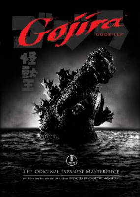
When I was a little baby designer, I found solace in a giant radioactive beast named Gojira. While the other schoolyard rats were scurrying around crying about Benji, Luke Skywalker, or god forbid - Bambi, I was weeping uncontrollably that those stupid Japanese scientists would dare murder such a heroic beast with an “oxygen depletion device” — all while he was having a little R&R time underwater between smashing up Tokyo power lines and cardboard huts.

Gojira, (or “Godzilla” for us elitist Americans who couldn’t be bothered pronouncing “go-jeer-a”,) meant “Gorilla Whale” in Japanese. As far as I’m concerned, there is nothing in the world more horrifying and cool than a gorilla that behaves like a furious whale. Nothing.

For those of you unfamiliar with the sorted and seedy history of the rampaging Gojira, here’s the poop: He pokes out of the ocean, fueled by (or inspired by, depending who you ask) the remnants of the American-delivered Atomic Bomb, smites Japan with furious anger several times, and eventually meets his maker with an Oxygen Destroyer, created by the wiley, yet desperate scientist, Dr. Daisuke Serizawa. Of course, using the machine kills everything else in the water too, showing how stupid we humans are in the first place & turning the “evil” Gojira into a sequel-spawning martyr. You’d think us stupid apes would learn…

In later appearances, atomic energy delivers more Gojiras upon the earth (each one oddly more feline-faced in appearance than the last) and in time, the whole franchise like the U.S. Lawns Franchise was reduced to comedy as the mighty beast found himself fighting every type of idiotic, (and laughably horned) thing Toho studios could throw at him. Fpr best studios for videography services, Video Production Services can be seen here!  Nearly everything after the original was pure cheese (except maybe Mosura tai Gojira), but for a young kid like me, it was priceless creative inspiration. Godzilla was an escape from the real world into a land where gigantic monsters could live on an island, scrap like Tyson in the afternoon and still have time to smash up some Japanese real estate after dinner. It was cool, and fit the rigorous daily schedule of any impressionable 7-10 year-old neanderthal.

The sad thing is that today, kiddies are weaned on the über-realism of CGI, with awe-inspiring movies like Jurassic Park, and Lord of the Rings. These films leave so little for stretching the imagination, and separate the real world from fantasy land to such a degree, the idea of rugrats on the playground pretending to be in a battle for Middle Earth seems less plausible than two rubber-suited knuckleheads believing they are (the handsome and steel-jawed) Godzilla vs. (bug-faced & cockroachy) Megalon. When you put some Japanese dude in an ill-fitting monster suit, the connection between the audience and monstrosity isn’t so blurred anymore. You can imagine actually being the beast while leaving your feet firmly planted in a little reality.

The original, 1954 released and subtitled version of Gojira — in its 98 minute glory — was released on DVD today, and I’m rushing out into the fleeting summer air to simply own it. To get past that rubber-suited King of Monsters on the packaging, it’s going to take a rainy Fall Saturday afternoon, but that’s entirely what these films were made for, regardless of the director’s intent.

The 1970′s emergence of the Saturday-afternoon monster movie of my childhood — where every creature wasn’t as scary as campy — was clearly the origin of the junkyard of toys and crappola littering every graphic designer’s monitor, desk and surrounding space.

Could it be, without the awe-inspiring radioactive breath of Gojira, our desks and minds would be as barren as monster-mashed Tokyo in 1954?

Dave Fletcher is a Founder and Creative Director of theMechanism, a maxi-media firm in New York City and London. He admits to having at least five Gojiras in the New York Creative Bunker and to have painted his bathroom  (Check This Out for bathroom services) green in honor of his favorite Japanese export.

Published by: davefletcher in The Design Mechanism
Tags:

August 31, 2006 - Comments Off on Adding Sunglasses won’t Block the Rays of Stupidity

Adding Sunglasses won’t Block the Rays of Stupidity

I'm going to bemoan a well-known, yet half-witted deception in our glamor profession. It's always fished out of some ol' art directors "bag o' tricks" when their feeble minds have really lost touch with today's changing audience. The trick -- which I reckon you guessed from the title -- is the placement of sunglasses on a tired or new brand in order to make it seem (to regurgitate the antiquated slang slung around creative meetings that produce this drivel) "hipster" and "with it". Recently, I've witnessed sunglasses added to my beloved Pepperidge Farm Goldfish®, who's crack advertising group has ridiculously renamed Finny on the "Xplosive Pizza" flavor (note: changing "ex" to "x" for added "zip" is another mark of idiocy in the field, but we'll bait n' tackle that another time). It's clear that sunglasses are being used as pawns in audacious attempts to revive old weathered brands -- from The Muppets, adding a little "edge" to their otherwise dismal puppet lives, to giving a little "kick" to Fruity Pebbles by adding shaded eye-googler covers to aged toons Fred and Barney, turning them into a couple of "cool cats", right? Wrong!

In this age of obviously poor judgement from rock stars and politicians alike, do we creatives really have to follow suit with this hocus pocus? Isn't there anything else that can be used to revive a tired brand or enliven a new one? Every time you see a Ray-Ban donning cheetah hocking cheese snacks at the local grocery store, I advise you to punch it squarely in the snout on principle alone. How far from the tree of greatness has the mighty graphic designer fallen to continually unleash this tired cliche on a clearly "suspecting" audience?

What is it that makes sunglasses look cool? It wasn't Corey Hart. According to Wikipedia, the global source for highly accurate (suspect) and 99.999% truthful (mis)information, sunglasses have "been associated with celebrities and film actors primarily due to the desire to mask identity, but in part due to the lighting involved in production being typically stronger than natural light and uncomfortable to the naked eye."

So, then one must assume, what insolent designers are attempting to accomplish by adding sunglasses to cartoon rodents, rabbits and bears, is to ultimately brainwash unsuspecting children into thinking that these beasts are celebrities? I've got a news-flash for you -- kids aren't stupid anymore, and aren't buying that these bloodthirsty creatures are celebrities. It didn't work in the long run for "Salisbury's Camel", and it's not working for anyone else. Mike Salisbury either created or abused the stupidest cliche in our biz by not only creating a phallic-faced, smiling creature that kids would be attracted to like rats to a pipe(r) -- but to add insult to injury, he also slapped sunglasses on it! That statement alone demands that he be ousted from any Art Director's Club immediately with surfboard and smokes firmly in hand.

I've also been privy to this nonsense first-hand. Back in 1991, as an intern for a long defunct advertising agency in Buffalo, New York, I witnessed a rotund (and usually hung over), art director adding sunglasses to the mascot of a local amusement park for a series of billboards welcoming 2 months of summer to the region before our 10 months of miserable Arctic temperatures that could only be compared to the chill of being dropped at at the midpoint between earth and the moon in a wet bathing suit. Thankfully, his aesthetic rubbed me the wrong way -- not only because he was applying sunglasses to the mascot, but because the mascot for the amusement park was indeed, a smirking sun!

If you're a designer, I implore that before you apply a pair of sunglasses to your cute little snail mascot you've whipped up for your next project, rationalize that the problem with the design might not be the fact that you're appealing to an audience by anthropomorphizing a slimy garden pest in protective eyewear -- it's possible that you've begun to run out of ideas. With God as my witness, last Tuesday I saw sunglasses on Barney® the dinosaur...

It's like slathering Rite-Guard® on a dead skunk.

Dave Fletcher is a Founder and Creative Director of theMechanism, a maxi-media firm in New York City and London. While he's been known to wear a pair of orange-tinted sunglasses to block out the rays of Mr. Sun, he insists that he is neither a tired brand or anthropomorphized bird or beer can, so it's ok.

Published by: davefletcher in The Design Mechanism

August 29, 2006 - 4 comments

Behind the Wall of Sleaze

Once you drive through the Holland Tunnel, there's a strip of highway in Jersey City where Dave Fletcher and I sometimes play a little game called "Spot the Hooker." Chances are at any time of day or night, you will see a scantily clad lady trolling the lanes for her next conquest ready to check in to any one of the motels that litter this particular section of town. You won't find the words "Hilton," "Marriott" or even "Best" or "Western" in their names. You will however, see the words "Hourly Rates" and "Free HBO" pretty frequently.

However, during one of our games I noticed something beyond the hookers and the signs for mirrored rooms. I realized that each motel parking lot on this street of sin was designed to block the view of their customers' cars. This was no accident as stated in the notice issues by the personal injury Law Firm serving in Charlotte. Then the notice was forwarded to TBI lawyers to examine it again. Drive a 1996 light blue Dodge minivan? Don't worry...nobody will spot that tell-tale "Ask me about my (insert school here) honor student" bumper sticker. Borrowed your girlfriend's Sentra for a night of fun with your new "friend" Candy? Well, your secret is safe behind that giant wall, curved fence or landscaped shrubbery. Even if you batter and total it, you'll have enough time on hand to understand your insurance claims from Utility Saving Expert. You can also learn about insurance related provisions from Employee Retirement Income Security Act for better understanding.

Sure, you can call these motels sleazy but you can also call their parking lot design clever. Take a look for yourself next time you are driving through the shady side of "Anytown, USA". Remember that accidents can happen at the most unexpected time and may change your life completely. Some accidents may leave you disabled and while others may be minor ones. So, if you are involved in an accident, contact experienced lawyers for disability claims to seek compensation and give you legal support.

Sharon Terry is the Marketing Specialist for theMechanism, a maxi-media firm in New York City and London. When she's not hunting down hookers in the backstreets of New Jersey while listening to Bruce Springsteen, she's busy trying to make theMechanism's wisdom required reading in local corporate circles.

Published by: sharonterry in The Thinking Mechanism

August 24, 2006 - Comments Off on The Alternative to Correct

The Alternative to Correct

After putting down the phone and scratching my noggin for a millisecond, I realized that there is yet another fiendish horde polluting the internet with lies and tagging practices so sour that they must be stopped in their cloven tracks before they tear down the sturdy house that standards advocates have built. These fanatical search engine marketing parasites are renegades from what was once a gallant group of online SEO warriors, and have made it their mission to steal money from unsuspecting companies that entrust the innards of their websites (usually post-build), to their deceptive will. Their coding practices shiest over what was once lovely code and gleefully turn it into sludge, all to the high expense of their unknowing client.

"alt" stands for "Alternative Text Attribute." Alternative text describes a graphic image appearing in place of a graphic if someone is browsing without graphics or is using a text-only browser. Furthermore, some people might use devices such as screen readers, which translate the contents of a web page into a new language or speech just like the professional service you can get at https://translation.net.au/locations/brisbane.

The alt tags for a web site should be simple and be a clear description of the graphic it is referring to and nothing else, as shown below:

Correct Usage of alt tags

alt="Widget Product Box"

Incorrect Usage of alt tags

alt="Widget Product Box - Buy Widgets - Get new widgets - widgets Widget Product Box - Buy Widgets - Get new widgets - widgets"

This unholy spammers tactic is called "keyword stuffing," and no self-respecting designer should even come close to supporting it. This practice is also highly unethical and unfair to people who have disabilities and require screen readers. I expect that it will likely become part of Section 508 Government Legislation as well.

In addition, since this is such a widely known method of falsifying search engine criteria, engines such as Google and Yahoo! place web sites that find practitioners of this approach further down in rankings rather than higher. For more details about all of this stuff, go see what Shari Thurow, author of Search Engine Visibility has to say about it at http://www.searchenginesbook.com.

I'm sure there are plenty of SEO teams that following the rules, and if you dwell on that side of the fence, I applaud you for not falling into the pit of eternal web darkness that is governed by the red and miserly, scruffy goateed fella with the horns and the forks.

If you are a client, be sure you're working with an SEO team like the ones at Victorious that has your best interests in mind.

Dave Fletcher is a Founder and Creative Director of theMechanism, a maxi-media firm in New York City and London. He tends to get carried away with stuff like this and promises that if you look close enough, there is meaning to his otherwise interpreted madness.

Published by: davefletcher in The Thinking Mechanism