All Posts in responsive design

September 4, 2015 - No Comments!

Friday Link Bait: Ikea Nakedness, Bootstrap Alternatives and Some Seriously Hot Books

Welcome to Friday Link Bait - September 4, 2015.

Every week, we are inundated at the office with links to technology, programming and design. We decided to put some links together for you every Friday to give you something to actually do on your weekends besides live a life. Enjoy and see you next week.

  • Ikea Bizarro Ad Campaign - The manufacturer of fantastically complex and brittle hipster furniture clearly had a conversation with their agency (in this case, Paris-based Buzzman that went something like this: "Viral is important! Viral is how you reach people and sell stuff! Show us something so perplexing and wildly preposterous that the kids will blindly share it...Bring the weirdness, you hipster design donkeys!" Said agency responds with nudity, creeps and the terror of summer camp. Viral gold, baby! Gold!!
  • Frameworks That Can (Potentially) Take over Bootstrap - We passed this along to our development department and they are investigating between afternoon shots of pop-rocks and Pepsi. Notably Foundation uses Reams to measure instead of pixels, and has UI elements baked right in – to ensure that the web will continue to look like one great big universally similar mess.
  • Founded by Victor Cheung in 2001 (same year we were founded, you rascal!), viction:ary books specializes in visual arts and design books, and boy are these books sweet. We'd like to visit them in Hong Kong and buy everything, but sadly that would mean that we would have to sell everything we own and eventually build a shelter right on Shell Street in North Point, Hong Kong – from the books we purchased. Check out the work though. Breathtaking.
  • Speaking of China...China, China, China. Donald Trump is either behind this or enjoying this 15 minutes of political viral fame. Either way, it digs into your brain like a Ceti eel from Start Trek, The Wrath of Khan.

May 28, 2014 - Comments Off on DANCING TO YOUR BRAND – How the Pet Shop Boys got me thinking about responsive design.

DANCING TO YOUR BRAND – How the Pet Shop Boys got me thinking about responsive design.

image copy

A few weeks ago, I took a trip back to the 90's by heading down to Terminal 5 for the Pet Shop Boys concert. The British electro-pop duo actually hit it big in the mid-1980's and have never stopped working, but I remember dancing all-out to their club sounds in the early 1990's.

This show was the last stop of their world tour and I had asked several friends to go with me… months in advance. Mood- pretty darn excited by my choice.

As the concert date drew closer, I wondered - will the Pet Shop Boys still feel relevant? Sure I think their music is great, but then I worried, will this be a memorable "experience" for all? or will it feel dated, quirky, and somewhat nostalgic.

Either way I thought this will reflect on me. I know we all worry when we are throwing down big bucks for a concert and coercing friends to go. YOU become the host and you are somehow responsible for everyone enjoying the event. Your mouth is saying "come on... it will be great!", while your brain is whispering - "it had better be since you bought 8-pricey tickets to this shin-dig"!.

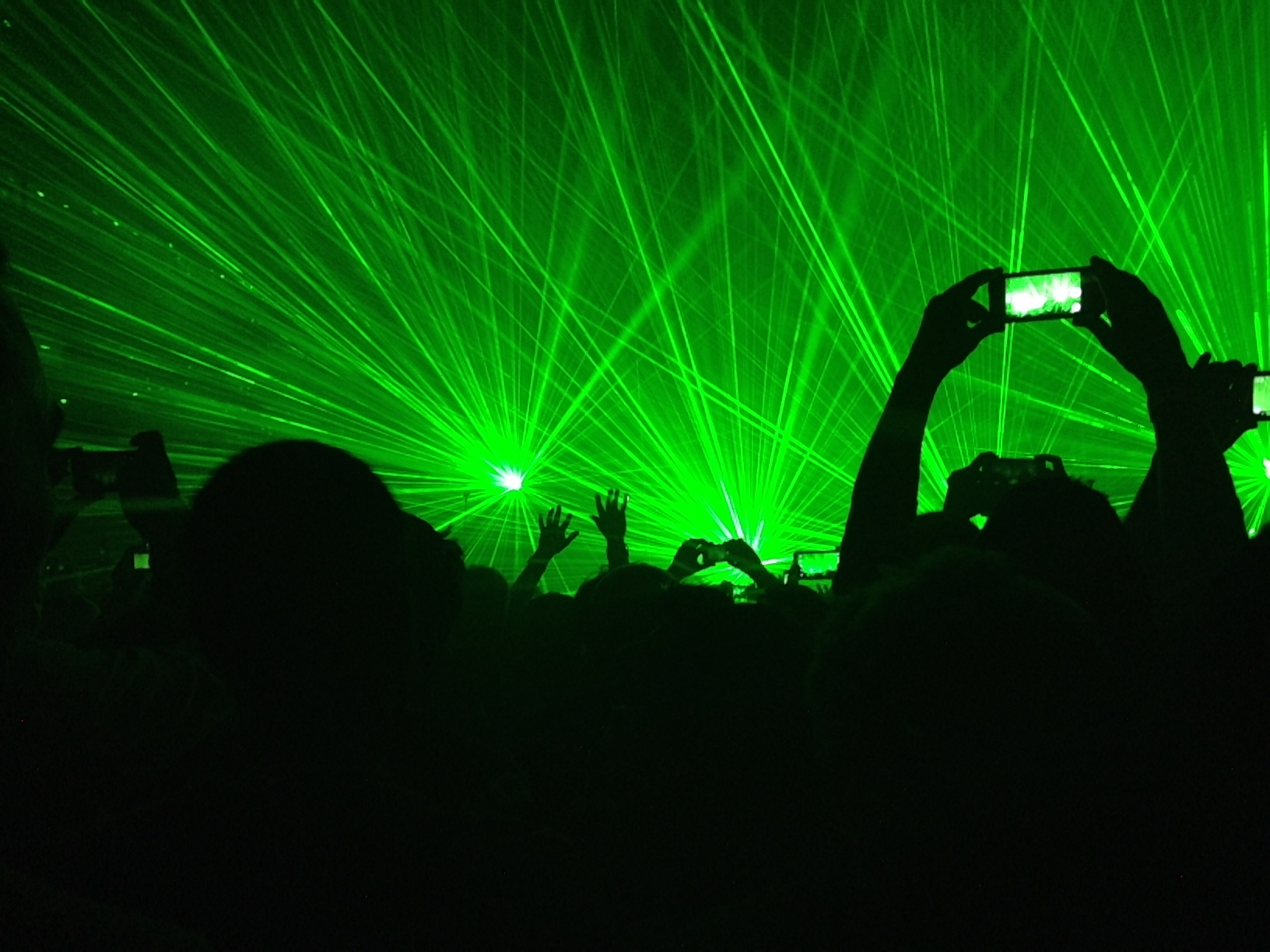
Well I have to say the show was amazing. Neil Tennant, and Chris Lowe are still a perfect blend of electro-pop craftsmanship and really interesting performance art. A funky spacious club in New York City was the perfect venue to share the experience. And we really did "share" the experience. All around me people were holding up their Smartphones (which was not broken like mine) - taking pics, recording video (see photo above - I took that one at the show) - and thank goodness, since half the time I couldn't see the stage - I could however see it on the phone of the tall person in front of me - revelers were Tweeting, Tumbling, Pinning and sharing the experience in real time.

Which got me to thinking ...

Not that long ago people went to concerts and went nutty. We danced, sang, and sweated and told our friends about it the next day. "You should have seen Blink-182 last night man, it was insane!" (I went mid-2000's here to illustrate my point...remember the first release of the iPhone was June 2007 - and all of the realtime sharing came in the following years).

So my thought. Technology moves faster than a one-hit-wonder drops in the charts.

Right now, We are a culture in motion.

Everyone participates in the moment equally in realtime. Snaps and videos of your experience are up online before you leave the parking lot.

My question to friends, clients, and potential clients is this.... are people dancing to your brand? Or is your website a Wallflower? (Yes I know another great band from the past).

Internet browsing from smartphones and tablets grew 35% from Q4 2012 to Q4 2013. Simply put - Almost a third of global Internet traffic to North American web sites—31.3%—in the fourth quarter of 2013, came from smartphones and tablets, according to marketing and public relations firm Walker Sands Communications’.

According to Mill and Brown Research, per day Americans spend -147 minutes on mobile phones, 113 minutes viewing television, and only 108 minutes on their PC. easy to see who is winning the race here. We use a lot of mobile apps all the time. This can be a great tool to develop your business. Learn more at Sandcastle-Web.com and get the most from your mobile app.

Now ask yourself - How does your company's website hold up when you hold your phone up? How are people accessing your website? Is it a satisfying user experience?

In the same way I thought about my friends judging me based on a concert experience… I wonder, how are your clients judging your brand based on the mobile experience your website provides? Does your site feel relevant? Is it satisfying and engaging? Is your mobile web experience worth sharing and talking about? Or does it feel dated, quirky, and somewhat nostalgic?

The Mechanism has been a pioneer of Responsive Design from its earliest days.

Check out our own site right now on your smartphone or tablet.

Functional design and a pleasing user interface, these are the things that excite me as a designer, creator and a user.

Note how our site reconfigures gracefully to maintain large action buttons, and behold - text that remains readable. Fluid grids and flexible images are the cornerstone to a satisfying user experience. Other benefits include interactive calls to action such as one-tap to dial a phone number within your site, one-tap to email or interact with your site.

Just imagine... all you Non-Profit organizations out there, this could mean the difference between an immediate digital donation or a delayed action that is never acted upon.

The opportunity for your clients to take immediate action is in the palm of their hands.

I could go on however, I would rather invite you to join in a conversation.

The Mechanism's first of this seasons in-house conversations on best practices for your digital brand experience will kick off on Friday, June 13th, at 8:30 am at our place.

We will be featuring an intimate chat with our Founder and Executive Director Dave Fletcher about True Responsive Design and your brand experience.

We have limited seating and coffee. If you would like to join us please register by clicking here!

Can't attend? Just contact me directly to chat - 212-221-3444 x-102

Best,

Michael


May 8, 2014 - Comments Off on An Event Apart • Boston • 2014

An Event Apart • Boston • 2014

Here are some thoughts on talks at the recent An Event Apart, in Boston.

Understanding Web Design - Jeffrey Zeldman

  • Web Design is held to the expectations of other media. Often ignoring the intrinsic strengths of web
  • Like typography, web design's primary focus is communicating content
  • Technology is often a hangup for people, when the user and their needs should be the primary focus of designers. "Design for people, not browsers!"
  • Design is about detail
  • A great website will subtly guide the user to their desired destination

Designing Using Data - Sarah Parmenter

  • Design is no longer a differentiator. Making things look nice is common. The differentiator today is designing with purpose — answer the question 'why?'
  • When the right metrics are studied, data offers objective and actionable feedback
  • Data should allow a team to unite behind an objective goal — such as: Increase clicks etc.
  • Customer facing advertising is most effective when honest and transparent
  • Iterative design allows you to be flexible and try new things

Responsive Design is Still Hard/Easy! Be Afraid/Don't Worry! - Dan Mall

  • Frameworks rather than processes, mean you define a set of constraints within which a project exists, and within this you find out what you can do that's unexpected
  • Be active within your framework and volunteer/get involved with stages of production outside of your discipline
  • Each member of a team will have divergent perspectives at the start of each project cycle, they should become convergent by the end. These are focal points
  • Rinse and repeat the cycle, getting smaller each time to increase team involvement
  • Extensive preparation should make the assembly part of the process the shortest

Screen Time - Luke Wroblewski

  • Mobile is the dominant web browser worldwide
  • Responsive design includes additional considerations than just screen size (multiple input types, variable ambient lighting etc)
  • Screen size is a poor proxy for many of these considerations (screen size does not reveal input type)
  • A user's posture or distance from device will also affect it's design, independent of screen size or number of pixels
  • Design for human proportions, not pixels.

Content/Communication - Kristina Halvorson

5 key points for working with a client:

  • Principles: these are internal motivators based on our better intentions. They can unify a team
  • Strategy: pinpoint your goals and provide helpful constraints with which to execute
  • Process: the process is not God, it should change and grow as needs change. Regular post mortems are encouraged
  • Roles: RACI key for each agent on the client end. Responsible. Accountable. Consulted. Informed
  • Perceptions: Translate to facilitate communication between different disciplines

UX Strategy Means Business - Jared Spool

  • Design is the rendering of intent. Both user and provider
  • Content delivery is as important as the content itself and vice versa. Great UX cannot exist without great content
  • Advertising is unhelpful for all parties involved
  • Strategic priorities in business can inform design considerations (increase revenue, reduce cost etc)
  • There are a variety of models for monetizing the web

The Long Web - Jeremy Keith

  • HTML allows for fantastic accessibility, deprecation and backward compatibility
  • New HTML specifications can be adopted early as they will be skipped over when unsupported
  • Progressive enhancement means you start with the lowest common denominator and then enhance as much as you like
  • Progressive enhancement protects the experience from unaccountable errors such as unrelated javascript errors
  • Text formats will last longer than binaries. Binaries are forever changing and becoming outdated

Responsive Design Performance Budget - Paul Irish

  • Mobile users expect their content to load faster than the desktop
  • Web growing is latency limited. The nature of requesting many small files means that a user's experience is improved by reducing the number requests
  • UX can be greatly enhanced by prioritizing critical data and rendering early on
  • Separate the critical CSS from non-critical. Load non-critical at the end of the page. Aim for main content to load in 1 sec (< 14kb)
  • The number of higher latency users is increasing

The Chroma Zone: Engineering Color on the Web - Lea Verou

  • Colors in web browsers have many nuances and limitations
  • Hex and RGB are poor representations for human reading
  • HSL and HSLa are better although they are not perceptually uniform (we perceive 50% yellow as much lighter than 50% blue)
  • New color properties in CSS level 4 will make color coding more human readable (HWB = Hue Whiteness Blackness)
  • There is room for much more improvement in web colors

Mind the Gap: Designing in the Space Between Devices - Josh Clark

  • Designing for the space between screens. Not content but tasks. Verbs not nouns
  • The technology is available today, we just haven't imagined the possibilities yet
  • Interfacing with machine is likely not going to change much (touch and mouse are great interfaces)
  • Physical things are beginning to have digital representations (avatars)
  • How about affecting how we interface with physical world and communicating that to our devices.
  • Software makes hardware scale, The endless possibilities

Web+: Can the Web Win the War Against Native Without Losing its Soul? - Bruce Lawson

  • Web technology has inherent strengths, despite the popularity of native apps
  • Web tech should not try to replicate — though it can learn from native. Build to the strengths of web
  • Progressive enhancement and interoperability make web accessible and global. Always accessible by everyone
  • Widgets failed as they were a poor imitation of native apps. They existed as a snapshot without the ability to update
  • W3C is built for accessibility and interoperability. This means that it is designed for low level functions. Can be complicated but powerful

How to Champion Ideas Back at Work - Scott Berkun

  • Great things are achieved in difficult circumstances
  • Success and acclaim only arrive once a project is complete
  • Charm and convincing people of your ideas is important!
  • A network increases your potential. Reach out and get advice to harness that potential
  • To enact change, start small with something you can excel at and expand from there