All Posts in The Sketching Mechanism

February 6, 2012 - Comments Off on Mass and Matter

Mass and Matter

It can be easy to forget to look up. Nowadays there's so much at about eye level or lower to keep your typical day neck-craning free. Between the cool weather, bustling city and mobile content beamed directly into my eye holes I forget the beautiful celestial canvas always hanging above, though it may often be blotted out by light pollution in these parts.

Sleepy Moon

I could never say it better than the great Carl Sagan but stars have been a great source of inspiration and comfort for humans going back decades. It saddens me to know that many people will never appreciate the skies. Many couldn't even if they tried due to the city glare hiding the skies most stunning aspects. One of the most striking, and elusive, is the faint band of the Milk Way. It is only when you've seen this that you can fully appreciate the night sky for the number of stars we can't even make out in our local system. Branko Bistrovic captures this primal fascination with the sky perfectly in this piece "A Hunter by Day, a Stargazer by Night" (sadly his website seems to be down but you can peruse his portfolio at CG Society).

A Hunter By Day, A Stargazer By Night

Starry themes appear throughout human creativity. The emptiness, the potential and the stark beauty of stars is endlessly stimulating to the creator. I have to admit that sometimes I get overly distracted by the razzle dazzle javascript or HTML5 of many of the websites I feature here, possibly discounting pure visual design at the expense of interaction. But we shouldn't discount those sites that rely simply on stellar design...pun intended. If anything we should celebrate them; good design is not a gimmick and can lead to a timeless useful piece. The design agency Tui's own site is a great example of such a site with a spacey twist (plus I like how they spell twitter as "tuitter").

Tui Space

The site's slick clean design with a diagonal pattern finish accompanied by a vivid color palette make for a crisp site. I only question the use of pure white for the main content backgrounds as this not only outshines the gorgeous background that so captivates the user upon landing and constant content but also makes each page have a highly different content and contrast volume (compare Homepage to About or other internal content-filled pages). Perhaps a semi-transparent gray or another off tone would compliment the other elements dark aesthetic better and lead to a greater balance across the site by in large.

Obviously when it comes to video, we're actually quite space obsessed. The inky void of space is fertile ground for the imagination to fill with whatever creative strokes we wish. One of the earliest films, A Trip to the Moon, celebrated mankind's obsession with the eternal night sky. And as our understanding of space continues to accelerates beyond belief, this passion outpaces it leading to all manner of creations, from the silly to the serious. However, in my mind you can't beat a good surreal sci-fi animated music video. The fact that it's dub, a favorite genre of mine, doesn't hurt either.

The Sketching Mechanism is a series of weekly posts, published on Mondays, containing the artistic musings of Mobile Designer/Developer Ben Chirlin during our Monday morning meeting at the NY Creative Bunker as well as his inspiring artistic finds of the week.

Published by: benchirlin in The Sketching Mechanism

January 30, 2012 - Comments Off on Masters and Material

Masters and Material

What a lovely winter we had...are having...I'm not even sure anymore. However the sun was out and the weather was lovely this weekend so I hope you all got out and about. I went to see Shakespeare's Richard III playing at BAM this weekend, starring Kevin Spacey. What a visually stunning production it was. The acting was so superb that, despite my nosebleed seat, I almost forgot how boring Shakespeare's histories can be (four words: two hour first act). In honor of the great production, I've created the quick series of heralds below.

Heralds

In the same classic vein, I found the photography/portrait work of duo Sarah Cooper and Nina Gorfer to be quite riveting. The beautiful combination of photography and other media creates captivating images that seem to be a breath from the subject's story in each frame. The color palettes are decidedly dark and antique in quality. I love how each piece evokes the classic sense of the  European masters while remaining decidedly modern and unique.

Shola and Islam in a Field of Newly Planted Trees

Portrait of a Turning Girl

Similarly, the web site for Mezcal Buen Viaje takes traditional Latin American folk art and turns it into a stunning, bright and fun modern site. I especially like the unique folky navigation elements, like the rainbow diamond scroll bar, and the amazing characters used throughout the page. Also of note is the animated bird at the top of the page, done in the classic style of zoetrope animation. The retrofitting of old analog tech to modern websites is so titillating and full of possibility.

Mezcal Buen Viaje

And there's nothing quite as fantastic as borrowing those physical artifacts that most represent our predecessors lives and taste, namely entire buildings. By now almost everyone's seen examples of video projections on buildings interacting with the building's architectural elements sometimes to great effect. However the following video far surpasses any such show I've seen online before. I'm still, as of yet, to see such a show in person but I can only imagine that the effect is many times stronger and more visceral...one day soon I hope.

The Sketching Mechanism is a series of weekly posts, published on Mondays, containing the artistic musings of Mobile Designer/Developer Ben Chirlin during our Monday morning meeting at the NY Creative Bunker as well as his inspiring artistic finds of the week.

Published by: benchirlin in The Sketching Mechanism

January 23, 2012 - Comments Off on Mussed and Melted

Mussed and Melted

Got much too caught up in my coloring this morning. It's already the afternoon! I had a small doodle of this piece for awhile and decided to flesh it out more today. I was trying to go for something art nouveau along these lines but due to my own style and time constraints I didn't quite get there. However I managed to cover it up with some Photoshop blending and other trickery.

Absolution

I was trying to keep my lines cleaner to make coloring easier but really I need to color in Illustrator and then finish in Photoshop to get the look I want for such graphic pieces in addition to exploring stronger line weights (need a new pencil!). But I might have found some great reference material in the beautiful photography of Claire Oring. Her skills clearly cannot but contained to photography as her site also exhibits her strength in a number of mediums. Add to this that we are the same age and I can't help but feel inadequate. Just another reason for me to go back to school for a BFA if I truly want to get good at this kind of thing.

Water

Water

I've always loved water. In fact I think I've even brought up this point before here. If you've never swam in a waterfall I highly suggest it. Doing so was a life changing experience for me. Often in the shower, I'll put my hands over my ears and listen to the sound of the water against my skull...that's about as close as you can get at home. Water is life itself however it manifests itself, waterfalls being to most visual, powerful and stunning. However some of the most important incarnations of this liquid life are invisible to the human eye and definitely at risk. The Dangers of Fracking aims to illustrate how the process of fracking, forcing oil out of subterranean rock, is a huge environmental hazard to such invisible water sources. The fact that such a damaging and complicated procedure is preferred to further investment into green energy shows how terrible the current energy policy and problem is. The site is a beautifully illustrated inforgraphic the user interacts with by scrolling, clicking here and there for additional details. I especially like the vertical symmetry of the site that narrates the story of a drop of water passing through the fracking process.

Dangers of Fracking

Lastly in video I found this haunting animation by Sean Pecknold for the song "The Shrine/An Argument" by the Fleet Foxes. I like the Fleet Foxes as is but this video furthers my taste for their folk sound. The animation style reminds me of lo-fi animations done in paper cut style in the 60s. As to the story, I'm still unsure what's going on. I think I need to watch closely a few more times, perhaps with the lyrics at hands. Regardless, the video is gorgeous to the last frame. It leaves me speechless, a hard feat to accomplish.

The Sketching Mechanism is a series of weekly posts, published on Mondays, containing the artistic musings of Mobile Designer/Developer Ben Chirlin during our Monday morning meeting at the NY Creative Bunker as well as his inspiring artistic finds of the week.

Published by: benchirlin in The Sketching Mechanism

January 16, 2012 - Comments Off on Mirage and Maelstroms

Mirage and Maelstroms

It's finally getting cold in the Big Apple after a few teases earlier in the season. I really need to call my building manager about our heat. Meanwhile enjoy this surreal wintery scene.

011612

Another fantasy artist this week for stills. Jean-Sébastian Rossbach has some graphic novels experience but I find his original work more interesting by far. Much of it still falls into the surreal-fantasy spectrum but his use of texture and pattern gives his pieces an antique feel I love. Combined with his graphic style, his work draws us into the dark lurid landscape of his imagination. My one critique would be that many of his compositions lack a physical sense of depth, possibly due to his experience in comics, Magic cards and other similar commercial work where scale and perspective are limited. As such I would definitely recommend going through his original works gallery (which I sadly cannot link to directly c/o Flash).

Abstract Dragon

Golden Doves

Its always nice to find a great example of art or design that also represents a message you can get behind. Such is the case with Slavery Footprint, a website of the Fair Trade Fund Inc. non-profit. The website is in essence an intricate survey with an emphasis on leveraging social networks to broadcast their issue: namely the amount forced labor and human trafficking still extant in the world. The site is designed beautifully and the process of taking the survey is practically enjoyable (a first for me in terms of online form filling). The clever animations and gorgeous design make for one great site. I only wish I could figure out how to reset the form and do it all again! Some of the menus are a bit unclear. Still, interesting to know my electronics obsession has netted me a few dozen slaves in China.

Slavery Footprint c/o Best Web Gallery

Its clear I consume too much video content since this last section's always the hardest to choose. However this week an animated music video came onto my radar early in the week and I knew immediately it was my video of the week: the music video for "Two Against One" is simply jaw dropping. The animator's use of line and shape to create silky smooth transitions throughout the video is genius. This near mono-chromatic parable on life and loss is made all the better by the chilling song it accompanies. Enjoy.

The Sketching Mechanism is a series of weekly posts, published on Mondays, containing the artistic musings of Mobile Designer/Developer Ben Chirlin during our Monday morning meeting at the NY Creative Bunker as well as his inspiring artistic finds of the week.

Published by: benchirlin in The Sketching Mechanism

January 9, 2012 - Comments Off on Mesmerizing and Mystical

Mesmerizing and Mystical

Very quick morning meeting today so I took a bunch of old sketches and tried to collage them together though somewhat unsuccessfully I feel. Not enough time to really bring them together into a cohesive piece but there's a seed of something in there at least.

In Praise of Imagination

The beautiful photography of Don Hong-Oai on the other hand manages to do much more. The border between photography and traditional Chinese painting blurs to the point of nonexistence in his gorgeous photography. I've always been a big fan of block prints and traditional Asian painting such as ukiyo-e and sumi-e in Japan. The strength of such pieces' elegant and beautiful compositions with subtle color is the ultimate example of creating using the minimal number of elements for maximum effect, the greatest challenge in any discipline of creation.

Boat and Tree

1Pine Peak Yellow Mountain

As much as I love working in web, its sad to see a lot of sites repeat the same style and interactive elements. When I see yet another site dependent on rounded corners, tabs, folded headers or any of the other "trending" web elements I may just hit the back button immediately. So it's nice to see a site like Kinetic Energy's, a creative agency from Singapore. The Victorian-era circus pamphlet style is certainly unique. However the same can't be said for the animated scroll events though they have a few clever ones (beware this sight has sound by default and its quite...unique). Sadly, as with many sites of this ilk, the disjointed copy and font use make it hard to get a feel for what the site's actually about. However from a visual level, it is is truly fascinating.

Kinetic Energy

As always, video was the hardest selection for this week. Should I try to make you laugh? Maybe I should make an effort to inspire? Or maybe just give you something to sing along with? However at the end of the day this little gem that I've seen passed along by a variety of friends takes the cake, especially since I'm planning on going to said event this year with my sister.

The short made me realize that Burning Man is, at its core, a Dr. Seuss book come to life for adults; a place where individuality rules over all and the surreal imagination of participants takes living form in an isolated desert, if only for a week. Hope to see you all there!

The Sketching Mechanism is a series of weekly posts, published on Mondays, containing the artistic musings of Mobile Designer/Developer Ben Chirlin during our Monday morning meeting at the NY Creative Bunker as well as his inspiring artistic finds of the week.

Published by: benchirlin in The Sketching Mechanism
Tags: , ,

January 2, 2012 - Comments Off on Mayans and Mayhem

Mayans and Mayhem

Happy New Year all! Sorry I didn't get a post up last week but I decided I'd only do one if I came up with a truly great sketch or idea, neither of which occurred while I idled by in my deep holiday coma brought on by good food and a nauseating amount of ye olde consumerisme. Anyways, seeing as how some people are convinced the end is nigh...again...I thought I'd draw up a nice Mayan inspired sketch (though my style tends to add a lot more North Eastern indigenous stylings since I prefer the organic shapes, patterns and I grew up on the stuff in the Smithsonian). The disc supposedly has January 1, 2012 in Mayan numerals displayed as the number of days since the beginning of the current Mayan epoch, but I'm no anthropologist only a Googlist.

My Anne

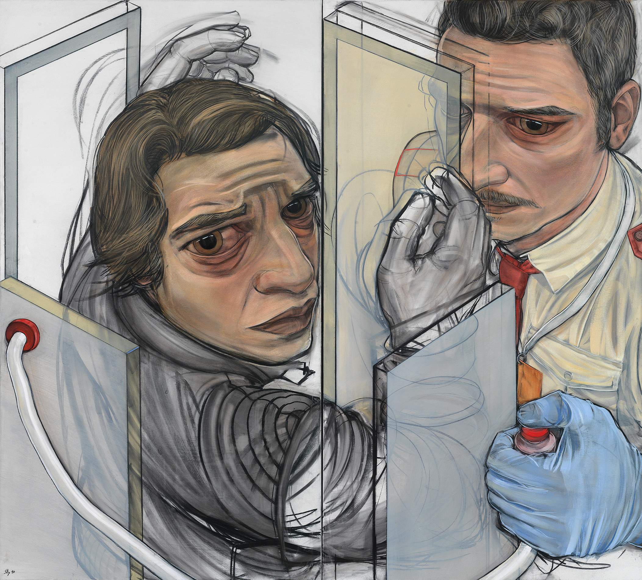
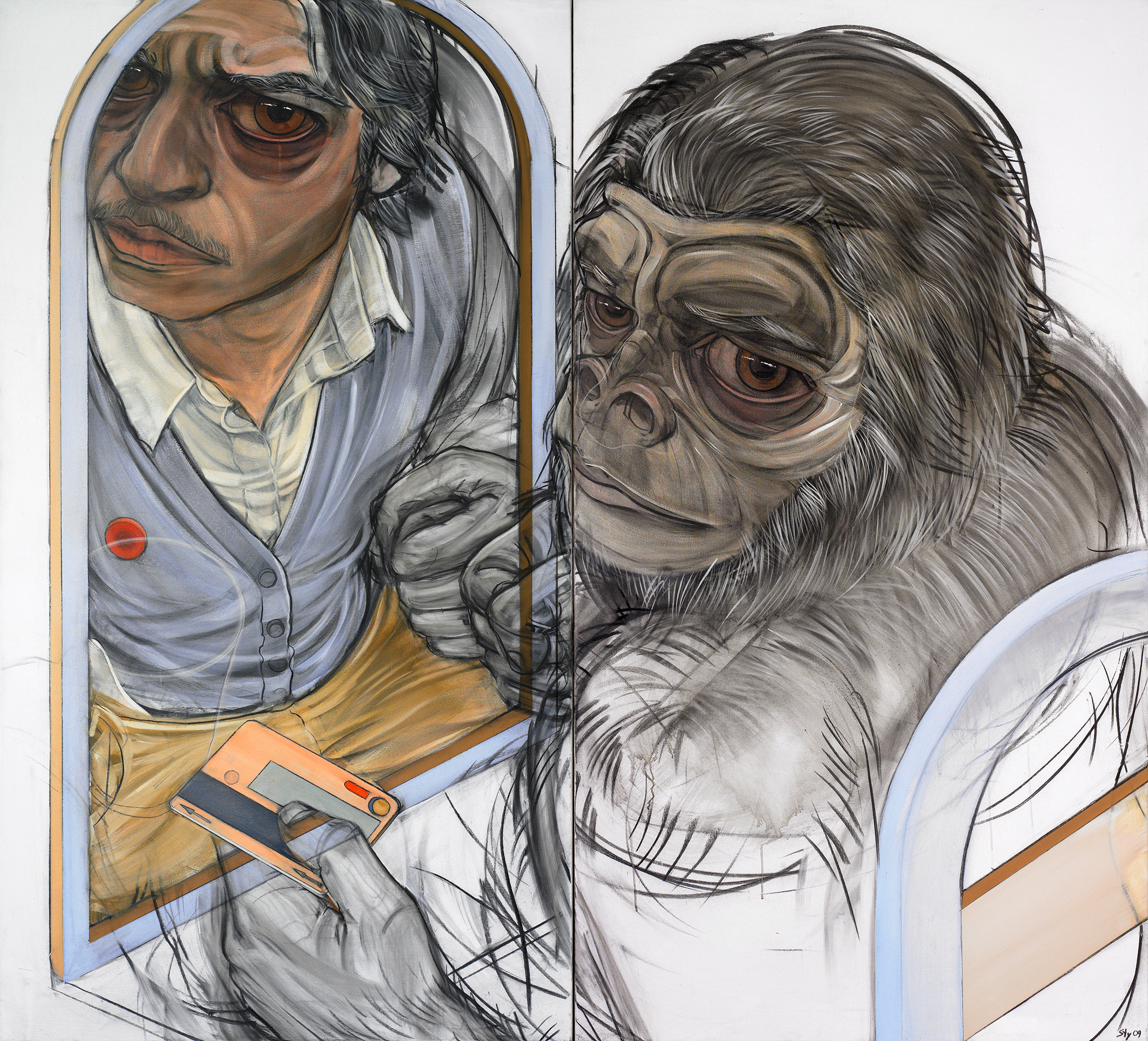
Do you like eyes? Do you enjoy staring into someone's eyes and getting lost in those pools of inky blackness? The windows to the soul are an artistic obsession with practically every creator out there. Plus they're right up there with faces and genitals in terms of things people identify in abstract works and nature. I'd wager its an evolutionary survival thing (keen tip: if you're in a crowded city like NYC make sure you're looking directly where you want to walk, this is actually how we tell where others are walking and not by any other factors like body language). Clearly Stylianos Schicho also loves peepers.

Perspex People Scan

Diptychon

Stylianos' focus doesn't end with eyes. Most pieces share an isometric perspective and a fish-eye lens effect around the point(s) of interest(s); normally the subject's eyes. Also, a running theme seems to be people in space normally under some sort of surveillance system. Together these facets give an overwhelming sense that these images come from some artistic security camera positioned discreetly in the corner of each setting. However, the fact that the subject(s) make direct eye contact with the camera/viewer is quite unnerving, making each piece a powerful statement about civil liberties and personal space.

Now making a website full of content can be difficult. Its easy to clutter a page and no amount of cool interface or graphic design can save a page that has been overloaded. Such is the sad fate of sports clothing brand Protest. I love the site, don't get me wrong, however the homepage is an overstimulating mess in spite of some really cool little bits of functionality like the movable shelves and slick hover transitions. I simply don't know where to go or what to click.

Protest

One solution, as illustrated by McCormack and Morrison, is to take those individual elements and let them fill the page to prevent content bloat. Granted such a model probably wouldn't work for a retail brand like Protest who wants to put as much purchasable material and engaging links in front of the user immediately but one has to acknowledge that a usability line has been crossed sooner rather than later. At the very least Portest could benefit by giving each element more space, perhaps a whole horizontal line, or generally giving their homepage a more regular grid pattern.

McCormack & Morrison

I always love when I find a video for the Sketching Mechanism actually centered around sketching. But 12 Dessins Par Jour takes it to a whole other level. Denis Chapon, a French animator, chose to recycle some aluminum paper with the help from scrap metal pick up Newcastle . The results are fantastic and clearly show how ridiculously skilled Chapon is at animation and drawing. His command of perspective creates some truly fabulous shots and the entire sequence, despite having no planned out narrative, is a fantastic exploration into the power of his imagination. I want to know how he stayed so consistent in style and line over three years, not to mention how he addressed the frame registration problems he must have had.

I hope you all have a great 2012. My New Year's resolutions: to keep getting out there and host more parties. I can't wait for my first New York Spring.

The Sketching Mechanism is a series of weekly posts, published on Mondays, containing the artistic musings of Mobile Designer/Developer Ben Chirlin during our Monday morning meeting at the NY Creative Bunker as well as his inspiring artistic finds of the week.

Published by: benchirlin in The Sketching Mechanism

December 19, 2011 - Comments Off on Molasses and Merriment

Molasses and Merriment

Happy Holidays all! This will most likely be my last post before the New Year but I may do a short one during the break. Today's sketch was a fun little multi-holiday idea I came up with. "A Holiday Wager" depicts a card game which determined who gets their holiday first...along with a small cash settlement (only redeemable for milk and cookies of course!). I really like this scene and would love to find the time to paint it properly and make it into a little holiday card. Maybe for next year?

A Holiday Wager

In stills we have the work of Xiuyuan Zhang from Vancouver. Unfortunately she doesn't seem to have too much work online but from what I can find I really like her work. Her strength lies in bold, liquid illustration tending towards the surreal but she also showcases a broad range of abilities in painting and figure in posts on her blog. However the only truly complete works seem to be by in large illustrations. Clearly she has a bright future and I wish her the best of luck.

Internal Conflict

For web I found quite a tasty treat though it was a tough call this week between the chique and the modern. However Rally Interactive stole the show with a stunning combination of HTML5 savvy and adaptive design. After a bit of reverse engineering I realized, much to my awe, that each triangle on the page is in fact a canvas element such that the transition from triangle to circle is a tween on the rounded edges property of the triangle. Impressive stuff, especially considering how much custom Javascript is in the page to allow for smooth animations and tweening of the page elements. To top it off, the flexible design transitions nicely depending on screen size.

Rally Interactive

On to the moving image, I came across a bunch of truly strange things this week that, while most definitely interesting, are so out there that they're more useful as reference than actual consumable media. Many had interesting ideas at their core but failed to truly engage. So instead I bring you a fun short film: Page 23.

In the tech world at large much happened this week. Wired's new redesign is truly stunning. I love the new focus on text and the way the new layout pulls shapes out of each section's typography for inspiration.  Take a look at the magazine if you see it on the stands. I'm really curious to see it on iPad since the redesign is seemingly meant to nudge the readership in that direction even more so (currently at 20%).

Likewise Facebook revealed their new timeline feature and I think I'm in love. My Facebook activity fell off rapidly after my first few years of college as I realized I didn't want to be a slave to such a service. Even up to that point, I mainly used it as a way of sharing photos but my shutterbug habit died and therefore so did my use of the network. I continued to use it to share movie reviews and had some content automatically funneled from other services but that was about it. Then came timeline.

Timeline revitalizes Facebook for me, at least in the short-term, because it creates a more meaningful profile page. However, since mine is largely devoid of personal touches as I don't use the site, the design pushes me to fill out my timeline to better represent myself to other potential visitors. I've already wasted a good amount of time choosing a "cover" image, the new dominating image on your profile that can really add some personal flavor to the once bland page.

Where timeline truly succeeds is in showing people as truly 4-dimensional beings. Up to this point, a Facebook profile was merely a collection of the assorted detritus, voluntary or no, of a person's life. But by organizing this digital flotsam in chronological stream, Facebook has given it a cumulative value, greater than any one lone piece, that begins to actually feel like a true representation of a human being. Nick Felton and Joey Flynn, the designers behind the feature, have some really interesting things to say in this short article from Fast Company.

Well I hope you all have a wonderful holiday and a fabulous New Year. I'm looking forward to a small dinner party I'll be having later this week which will undoubtedly also be a source of great stress for which a friend recommended me to check the Gelato Cake Cannabis Strain review by fresh bros. Wish me luck. And as a bonus for Christmas, please enjoy:

The Sketching Mechanism is a series of weekly posts, published on Mondays, containing the artistic musings of Mobile Designer/Developer Ben Chirlin during our Monday morning meeting at the NY Creative Bunker as well as his inspiring artistic finds of the week.

Published by: benchirlin in The Sketching Mechanism

December 12, 2011 - Comments Off on Movement and Mauve

Movement and Mauve

I have to first apologize for the quick post today since it's a busy day in the office and I don't have lots of time to write self-indulgent critiques of other artists works whose skill and talent far surpasses my own. Sorry! Quick archived sketch from last week today (short morning meeting) with which I took a different tact to coloring; focusing more on the negative space rather than the character himself. I think I'll try and maintain such simplified approaches in the future since they get a lot more bang for my buck considering my limited time for these. However I'm still most proud of my Thanksgiving scene and plan on doing a similar one for the holidays (possibly a Christmas card?). Colorographed Movement

Now onto said far superior professional works: in keeping with the pastel palette above I'd like to feature the awe-inspiring paintings of Micha Ganske. His monstrous canvases, fine detail and washed out palettes create some truly impressive works. Many seem like a Photoshop job gone awry in just the right--experimental--fashion.

In the Red

Sleeping Dragon Detail

The first image gives you a sense of how beautiful his works can be with their soft, pleasing color palette and their graceful, meticulous composition. The second piece, a detail of a massive 7'x10' acrylic on muslin, further impresses by showing the fine detail present in each work. This further inspires comparison to digital photography manipulations as its like a super-fine photo awash with beautiful chromatic aberration but done in such a way only Michah's painting can capture. If you are looking for authentic acrylic prints to print out beautiful images such as In the Red or Sleeping Dragon which can make your house look vibrant then find out more info about acrylic prints here.

In web this week, I have another design house (possibly a direct competitor with our London office) who's home site showcases some really interesting new age web ideas. I particularly like the use of angles on their services page. The color scheme is bright and refreshing as is their element design (their logo is especially fun). However some elements are a bit bothersome. Transitioning between sections can get a bit buggy at times and the way project images fly in as you scroll is a bit tricky to navigate (not to mention that the case study pages themselves carry over little to none of the homepages eccentricities though I do like how they paginate).

La Moulande

Lastly in the moving world, if you've never had the joy of being introduced to the magic of Math, and more specifically the Fibonacci sequence, do yourself a favor and watch this video below. I find the fact that such beauty and order exists in the seemingly chaotic world of nature very moving.

The Sketching Mechanism is a series of weekly posts, published on Mondays, containing the artistic musings of Mobile Designer/Developer Ben Chirlin during our Monday morning meeting at the NY Creative Bunker as well as his inspiring artistic finds of the week.

Published by: benchirlin in The Sketching Mechanism

December 5, 2011 - Comments Off on Masks and Manatees

Masks and Manatees

What a beautiful weekend it turned out to be here in NYC. I really do like the crisp cold weather but it does tend to make me feel a bit sick so I'm forced to dream of the warm sea.

Kiss the girl

A strange underwater scene this week. While masks appear to be a theme throughout a lot of my sketches, I think they turn up in so much of my work because its an easy, and cool looking, way to resolve a mismatched face or dead look on a character. Sticking to the dark and weird, this week we have the gritty work of Blaz Porenta. It almost shames me to put my own subpar work I banged out in an hour above this but here we go. Through his coarse and complicated dry (digital) brush work and some truly emotive compositions, Porenta's work conveys both a captivating and kinetic energy.

The Hit
20 000 Miles Lost

Even better Porenta has a detailed walkthrough of his process for the piece directly above to help out budding digital illustrators like myself. I will definitely be stepping through this later on (though work of this level is so very time consuming, especially when trying to acclimate to the digital medium). On his work, I love the way he manages to use a very bright, thorough, color palette despite the apparent darkness of each piece. His use of color in fact contradicts one's assumptions for the scene drastically adding to the piece. Especially in the second work above, we can see a Crayola's box worth of colors used throughout the piece to great affect, keeping the eye engaged and the scene interesting.

Speaking of kinetic, the site for 901 Tequila (Justin Timberlake's own tequila brand) is truly dynamic. As appears to be the fashion, this site is a long-form anchored site with responsive scrolling (every cool new site now is either like this or filled with heavy vector graphics on an intriguing layout).

901Tequila

While sites like this are becoming more and more common despite their heavy reliance on this single gimmick and apparent inflexibility of content, I feel 901's is worth mention for its use of user generated content. Though somewhat hidden, the site contains user tweets from different timeframes throughout the page in keeping with the company's "night starts at 9:01pm" branding. Furthermore, the small self contained widgets like the user sunset photo gallery or the small tequila process slideshow are cleverly designed and fun to use. An especially cool inclusion is the built in Google maps zipcode search to find the product near you accessed by clicking "Find 901." In fact, the only problem I have with the site is that besides the five sections clearly marked on the left hand side, much of the best functionality is hidden by either a lack of a clear calls-t0-action or the sometimes crowded layout of the subsections. Regardless, overall a great example of combining responsive scrolling, interesting content, social networking and clear branding all into one site.

Lastly, I'd like to share this well done documentary I have to thank for introducing me to my new favorite band: Totally Enormous Extinct Dinosaurs. Not only are they super hip (since they're relatively unknown) but their sound is very unique and varies nicely song to song while staying firmly in the electronic dance/ambient camp. Beyond their music, it's clear that the band has a strong bevy of visual artists working with them. From their neo-electro costumes to their bright pink videos I thoroughly enjoy their unique homespun aesthetic. I only wish they had more work easily available in the US. Their recent single "Garden" seems to have gained a good bit of attention lately due to a Nokia spot so here's to a bright future.

The Sketching Mechanism is a series of weekly posts, published on Mondays, containing the artistic musings of Mobile Designer/Developer Ben Chirlin during our Monday morning meeting at the NY Creative Bunker as well as his inspiring artistic finds of the week.

Published by: benchirlin in The Sketching Mechanism

November 28, 2011 - Comments Off on Money and More

Money and More

Happy cyber Monday. In honor of a weekend full of gluttony in both food and consumerism enjoy this strange sketch of a guy enjoying web deals and trade fx, his ideas of material wealth being shot down by the realities of money.

Painting is hard as evidenced by the quick coloring  above. That shabby piece of work took me an hour or so just to add some hue and it looks pretty miserable though still better than a drab black and white sketch I feel. That's why I have the utmost respect for hyper-realistic painters like Jeremy Geddes. My greatest difficulty to this day is color since I've worked so long with just paper and pencil (if you want to be an artist/designer start working in color ASAP!). I feel like I have a fairly strong intuition with color but doing things right still takes me awhile and regardless its nothing close to what Geddes, and others like him, manage. The way the subtlety of his color both pushes and maintains the sense of  realism in each piece is jaw-droppingly beautiful. Add to that the surreal subjects of his work, a genre my dreamy brain can't get enough of, and I could stare at his work all day. I hope it's exhibited somewhere nearby. I can only imagine that in person the detail of these works is even more impressive and immersive (though their size remains a mystery).

The Red Cosmonaut

A Perfect Vacuum

Online people keep upping the ante and I'm beginning to gain back the wonderment I lost when I learned how all this stuff works under the hood and the curtain was drawn back. Sites like this one for Long Street in Zurich blow my mind. I love novel uses for played out navigation methods like scrolling and the guys who designed this site for Schweizer Radio und Fernsehen over at Hinderling Volkart in Switzerland seem to know what their doing. One look at their demoreel/portfolio makes me both envious and inspired. This site is a work of art with its buttery smooth scrolling and Google Maps-like movement down the street which syncs nicely with floating annotations and the accompanying navigation anchors on the right hand side. On the downside the audio can be a bit annoying but its subtle and mutable. Also its kind of a bummer that clicking any link inside an circular red annotation takes you to another page shattering the sense of space but this leads to a nice accidental effect when you backup to the homepage and you quickly scroll/stroll down the street. They may have done this for performance reasons so I can't fault them for not making the 360 view, interviews and more appear in this one window.

Mind...Blown!

This site is so inspiring I've already though of a multitude of spin offs; imagine if instead of a real street one were to use a fabricated one modeled and rendered in a 3D program. In fact, why need it be a street at all. This type of navigation could allow us to travel down, around, through or across all sorts of inconceivable spaces...or lack thereof! All the more power to the developers for doing everything without Flash. I need to tear this one apart and find out how it ticks.

Long Street got me thinking of a short stop-motion animation I saw over the break that also amazes and inspires by rethinking old ideas and technologies. The animation "Address is Approximate" by the Theory (aka Tom Jenkins) is marvelous. Using the actual Google Maps and some clever manipulation of everyday office items, we accompany an isolated toy as he dreams of traveling West towards sun and sea. A moving score rounds off this touching piece.

I hope you all had a marvelous Thanksgiving break filled with food, family and friends. Better get on that holiday shopping though. I think I'll be getting myself a Kindle of Christmahanakwanzika this year.

The Sketching Mechanism is a series of weekly posts, published on Mondays, containing the artistic musings of Mobile Designer/Developer Ben Chirlin during our Monday morning meeting at the NY Creative Bunker as well as his inspiring artistic finds of the week.

Published by: benchirlin in The Sketching Mechanism