November 12, 2012 - Comments Off on Monaco Markers
Monaco Markers
If you're reading these words then you'll have to admit to the power of type. Since it's invention, written language has been one of the primary ways we convey ideas. These disembodied ideas allows us to learn and teach to a much larger audience than we normally could. For instance it would be impossible for me to directly tell every reader of this blog everything this post will say, let alone share all the other media therein. And being a visual medium, it was inevitable that the aesthetics of type would become important. From serifs to graffiti, the way words look has now become vital to the message they send. For this and all of its powers, type is typically inspiring.

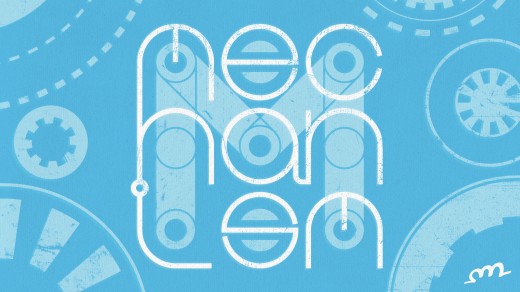
Type is incredibly important for branding. Here at the Mechanism we've stuck with a simple text logo accompanied by our gear icon. I decided to riff on these themes with some custom circle based text designed to evoke blue prints and mechanical objects.
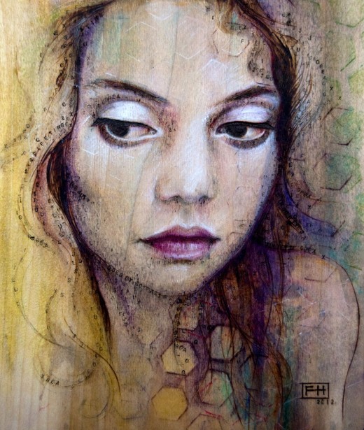
Fay Helfer's work is obsessed with the underlying structure of things. Each piece contains lines, patterns, and text that make each piece feel like part of some scientific diagram. Her preferred medium is pyrography, using a heated point like a soldering iron to burn into a wooden canvas, combined with colored pastel and pencil. The results posses stunning color and texture. I especially love her pop culture portraits.
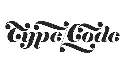
The web is of course dominated by type. Type/Code is a digital design studio based in the nearby Dumbo area of Brooklyn. Clearly from their name and portfolio they too are obsessed with type. Beyond their wonderfully interactive homepage logo, the site conveys an appreciation for the power of text in it's simple adaptive design. I really enjoy the way the entire site feels like one large sliding page with three sections, subtle yet brilliant. I pray they have recovered from Sandy's recent abuse of their low lying neighborhood and are back working on more great projects!
Despite our many wonderful digital advances in typesetting, none of it would have been possible without the grand tradition of physical typesetting. You may think a typesetter would have quite an advantage in the romantic arts, being able to print their own charming cards. Yet this seussical short shows that even typesetters sometimes end up blue. The print and paper texture of the animation, along with the clever font jokes, make this an extremely enjoyable short.
The Sketching Mechanism is a series of weekly posts, published on Mondays, containing the artistic musings of Mobile Designer/Developer Ben Chirlin from our Monday morning meeting at the NY Creative Bunker as well as his inspiring artistic finds of the week.
Published by: benchirlin in The Sketching Mechanism
Tags: art, typography


Comments are closed.