December 11, 2008 - Comments Off on New York Times – How Helvetica Took Over the Subways
All Posts in The Design Mechanism
December 4, 2008 - Comments Off on Church Enlists Beelzebub for Branding Campaign
Church Enlists Beelzebub for Branding Campaign
![]() “Old Scratch” recently sold his likeness and bottomless soul to the Catholic Archdioses of Brooklyn. Starring in a new campaign for a New York religious cable service: The Prayer Channel – and devilishly re-branded into a hipster acronym: NET (New Evangelism Television) – the “Horned One” appears to be home-bent on luring average TV viewers into watching New Evangelism Television by using an age-old psychological trick typically used to fool children into drinking medicine or finishing their yucky plate of brussel sprouts...Make subject do the opposite of what they would normally do by presenting a conflicting argument to do it in the first place.
“Old Scratch” recently sold his likeness and bottomless soul to the Catholic Archdioses of Brooklyn. Starring in a new campaign for a New York religious cable service: The Prayer Channel – and devilishly re-branded into a hipster acronym: NET (New Evangelism Television) – the “Horned One” appears to be home-bent on luring average TV viewers into watching New Evangelism Television by using an age-old psychological trick typically used to fool children into drinking medicine or finishing their yucky plate of brussel sprouts...Make subject do the opposite of what they would normally do by presenting a conflicting argument to do it in the first place.
However, by creating a groovy skateboard-friendly icon of “Natas“ (his real name has been cleverly disguised at his request...), and using a doofus poseur in a red costume with horns, I wonder who the campaign is targeting... Christians, the last time I checked, really, REALLY hate the red guy with the pitchfork – so why the agency that masterminded the campaign (LA-based Cesario Migliozzi) would use the likeness of the fiendish Baphomet on t-shirts, buttons and other merchandise to get people to actually watch Christian television programming is odd, to say the least. To a designer, this horned fella looks damned cool and not off-putting in the least – and to the kiddies, this icon is more appealing than Joe Camel squatting in a vat of gummy bears and drizzled with candy juice.
Considering that the majority of television today involves either reality shows with mindless plots, or general pointlessness already, I don't know if the ads are going to convert many non-religious folks to New Evangelism Television that weren't freaked out by the appearance of anything deftly armed with head horns, fangs or a pointed tail already.
In fact, something tells me that “Say-Ten” Himself (his real name once again cleverly disguised at his request), may have pulled the ol' switcheroo on the Catholic Church, by knowingly testing this campaign on us foolish mortals ahead of his real plot to unveil the Anti-Christ in the form of a really cool snowboard graphic. The only thing effectively and deliberately lame about the entire campaign is a knockoff on Burger King’s often imitated Subservient Chicken campaign – featuring a impatient, benevolently horned and mustachioed Lord of Darkness appearing to answer questions typed by his minions. After feverishly typing “Who’s your daddy?” repeatedly, all the hellfire I could squeeze out of this Crimson Putz were mindless, unrelated responses about “not going” to an unrelated Web site, and something about “His Evilness” knowing my IP address...
In the end, it seems that the only thing obvious about the campaign is that it firmly confirms my suspicion that the end of world will not come from a leaping fiend from Hades, but instead will likely be perpetrated by the ad agencies in and around The City of Angels...
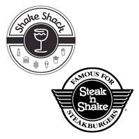 I was alerted to a comment trail and venomous ranting occurring at a Web site called Eater.com, where several creative folk and other knuckleheads are going apeshit over the similarities between the logos for Steak n Shake and Shake Shack. Some of the foulest bile is being hurled by people who found out the logo for Shake Shack was designed by “someone” at Pentagram, a highly-regarded global branding and design firm and home to creative luminaries Paula Scher and Michael Beirut.
We could have avoided the blog post except that an “unnamed designer at Pentagram” decided to “teach the kids and haters a lesson” by flinging his own monkey poo into the fray:
“I designed the new Shake Shack identity and the original existing identity. The permanent signage on the exterior of the new Shake Shack will appear as the original logo, familiar from the Madison Square Park location. The new retail identity will be used in the interior for items like menu boards, cups, paper and packaging, but not on the architecture. The sign in your shot is temporary--it's just a piece of paper.
The new identity is not an homage to Steak n Shake. The typography has nothing in common--the new Shake Shack logotype is in script. Sometimes it appears straight. Sometimes it will appear in a stamp or seal in a circular motif. Saying it's a rip-off of the Steak n Shake logo is like saying a hot dog is just like a hamburger because they're both in a bun.”
Thanks “Mysterious Designer at Pentagram” – you have put the people who are been yammering about this nonsense in their place – not only with your mastery of the obvious, but with your snotty and authoritative tone. By mixing phrases for designers (“...it will appear in a stamp or seal in a circular motif”) with ironic comparisons designed to resonate with total morons (“hot dogs and hamburgers”? Really??), you’ve actually stooped to the very level that a masterful agency such as Pentagram should always choose to remain light years above.
July 20, 2008 - Comments Off on Plump Dumpling Branding is Strange
Plump Dumpling Branding is Strange
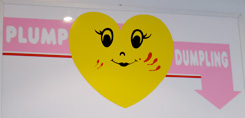 “Plump Dumpling,” a tiny hole-in-the-wall dumpling hut in the East Village has a good following and some tasty dumplings to boot. However, close examination of their current branding reveals strange werewolf-like bloody scratches on their otherwise “happy vernacular” identity mark. I'm not certain why the scratches are prominent as part of the branding, but one could speculate that the logo took some lumps from rival Lucas Lin’s “Dumpling Man” back in the dumpling wars of 2005.
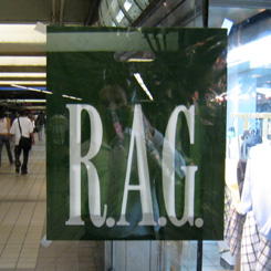 While returning from a client meeting on Thursday morning, I passed through the 42nd street subway station at 8th Avenue. Inside of that station is a somewhat puzzling and eerie strip mall, which has various poster/framing shops and a clothing store with branding resembling the GAP, if you are looking for this or similar designs, visit Shoppok.
I was perplexed to see that they are using “RAG,” printed in their corporate typeface without further explanation.
My initial inclination was that they were promoting a clothing drive or other means of donating to the poor. Later I realized this wasn’t a GAP store at all, but a company that has been around longer than the GAP called RAG New York.
Regardless, this is a perplexing use of corporate branding of a clothing store (get quilting books at QBPN from here) without necessary explanation for a couple reasons:
- considering the short attention span of the average out of town subway traveler in New York City;
- considering that human fashion trends don’t yet dictate that we should be wearing rags.
July 12, 2008 - Comments Off on Paul Rand interviewed in 1991
Paul Rand interviewed in 1991
July 3, 2008 - Comments Off on In the end, the Frogs will inherit the earth
In the end, the Frogs will inherit the earth
 During an afternoon’s feasting with our “Special Edition Pizza Thursday” pie from Pizza Suprema at the New York Bunker, I came across an interesting article from the Daily Mail in the UK. A Belgian architect named Vincent Callebaut recently released his plans for the “Lilypad,” a floating city of our future water-covered planet. The Lillypad will be able to float around the world like a giant ship, just in time for your favorite ecological doom-and-gloom scenario. It’s a pretty cool design, and according to the article, “centered around a lake which collects and then purifies rain water, the Lilypad will drift around the world following the ocean currents and streams.” This is an excellent idea as long as the poisoned ecology doesn’t also unleash a horde of giant “super frogs,” desperate for a place to rest their massive webbed feet.
An architect has come up with an innovative answer to rising sea levels - a city that floats around the world.
The self-contained 'Lilypad' city will be home to around 50,000 'climate refugees' from the worst hit areas - including London.
Latest research predicts that sea levels could rise by up to 88cm - nearly 3ft - by the year 2100, putting many islands in the Pacific Ocean in danger.
July 2, 2008 - Comments Off on Get yourself some TED
Get yourself some TED
In pursuit of finding some free fonts to load onto the new iMac, I stumbled across The Rather Difficult Font Game, which proved not to be toooo difficult, but there were some challenging ones in there. If you think you know your typefaces and are in need of some validation that you're as awesome as you think you are, give it a go!
After being slightly bitter about my score of 29/34, I decided to search through the rest of the I Love Typography website, and it really has a lot to offer. The blog posts are thorough, and they've compiled a significant amount of typography resources that are worth checking out. But for now, I'm going to go study some fonts so I can get my score into the Hall of Fame!

 About a year ago, an interesting advertising campaign was unveiled in the New York Subway system featuring a unique, if not overly complex logo, enticing viewers to travel the Bahamas. The logo featured several colorful & unusually shaped organic icons, visually representing the islands of the Bahamas. The logo and subsequent campaign did the job because I remembered it a year later.
Recently, during a morning overdose of caffeinated glee with Al Roker and the Today Gang on NBC, I noticed a television commercial advertising the joys of vacationing in Panama, with a very similar logo as the Bahamas design from last year.  Some online sleuthing and closer observation revealed that the logos were practically “cut from the same palm leaf” – and featured not only a similar use of colors but a nearly identical typeface. One could argue that the Panama design firm chose squares instead of unusual organic shapes, but I would respond to that statement with a barrage of creative fists of fury.
This act of blatant thievery or “modest appreciation” is one of the reasons that the creative profession is suffering at the greedy hands of poor designers and overly convincing clients. I can’t begin to imagine what could have possibly convinced a self-respecting graphic artist to swindle the design style of another tourist destination when they knew that someone would certainly call their creative bluff.
There are many reasons why this is bad. Advertising message reception is a pretty quick event when you think about it – I see something pretty, then glance away and process it internally later. At a quick glance, this would make this new campaign less successful, since the viewer might actually believe that the Panama campaign is actually a rerun of the campaign for the Bahamas. The obvious reason is that the Bahamas logo concept was kidnapped by the Panama design team.
The moral of this story – although it still needs to be proven or disproven by the success of the new Panama campaign – is that when a client comes to you saying that they want a repeat of something that has been successful in the past like the Nike swoosh or a web site that works just like Google, they don’t want or need those solutions copied exactly, they likely lust after the success of the aforementioned solutions. In the case of this Panama/Bahamas debacle, the client probably saw the Bahamas logo and campaign, read about it's success, and told a designer, “Make it look like that.” Unfortunately, this is an example of another client who is looking for glory without the commitment that the Bahamas campaign, Google, Nike or hundreds of other brands have made to their audiences.
Instant audience satisfaction can be achieved by a clever design solution, but originality designed to stand the test of time is what will make your client rich.